
Branding JIN by Design
It’s not often that we come across a founder who is this intentional about their branding from the very beginning.
A lot of the time, branding becomes something entrepreneurs need quickly—because the signage needs to go up, an application needs to be submitted, an opportunity has come up, or they simply need something to put on a document. The identity becomes a box to tick rather than something to thoughtfully build.
Josephine came to us differently.
She arrived with a document detailing the concept she had already been thinking through, references upon references, and a clear sense of what she was drawn to. During our workshop, she was able to articulate not just what she liked, but why she liked it. The perfect client.
It gave us the kind of foundation we love working from.
Concept 1
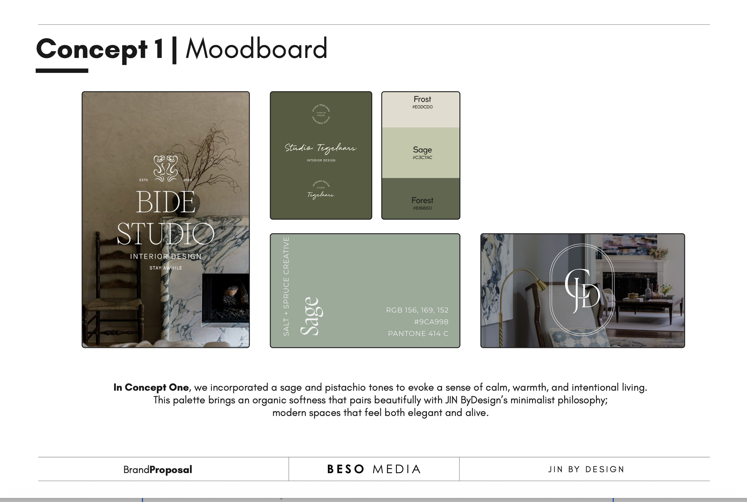
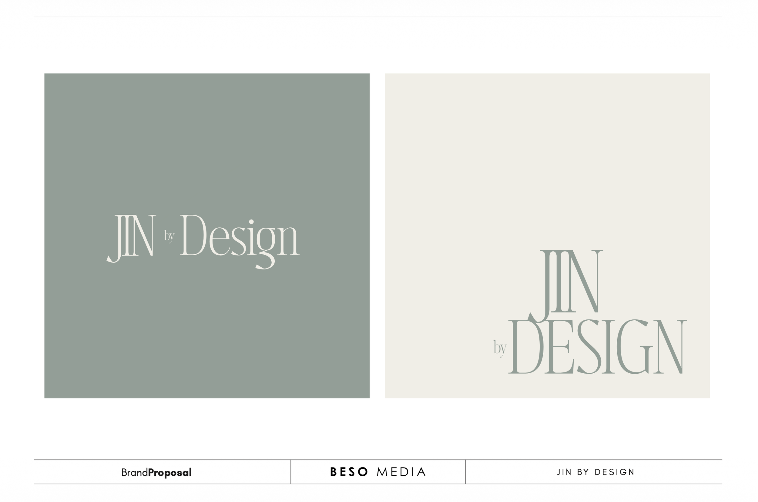
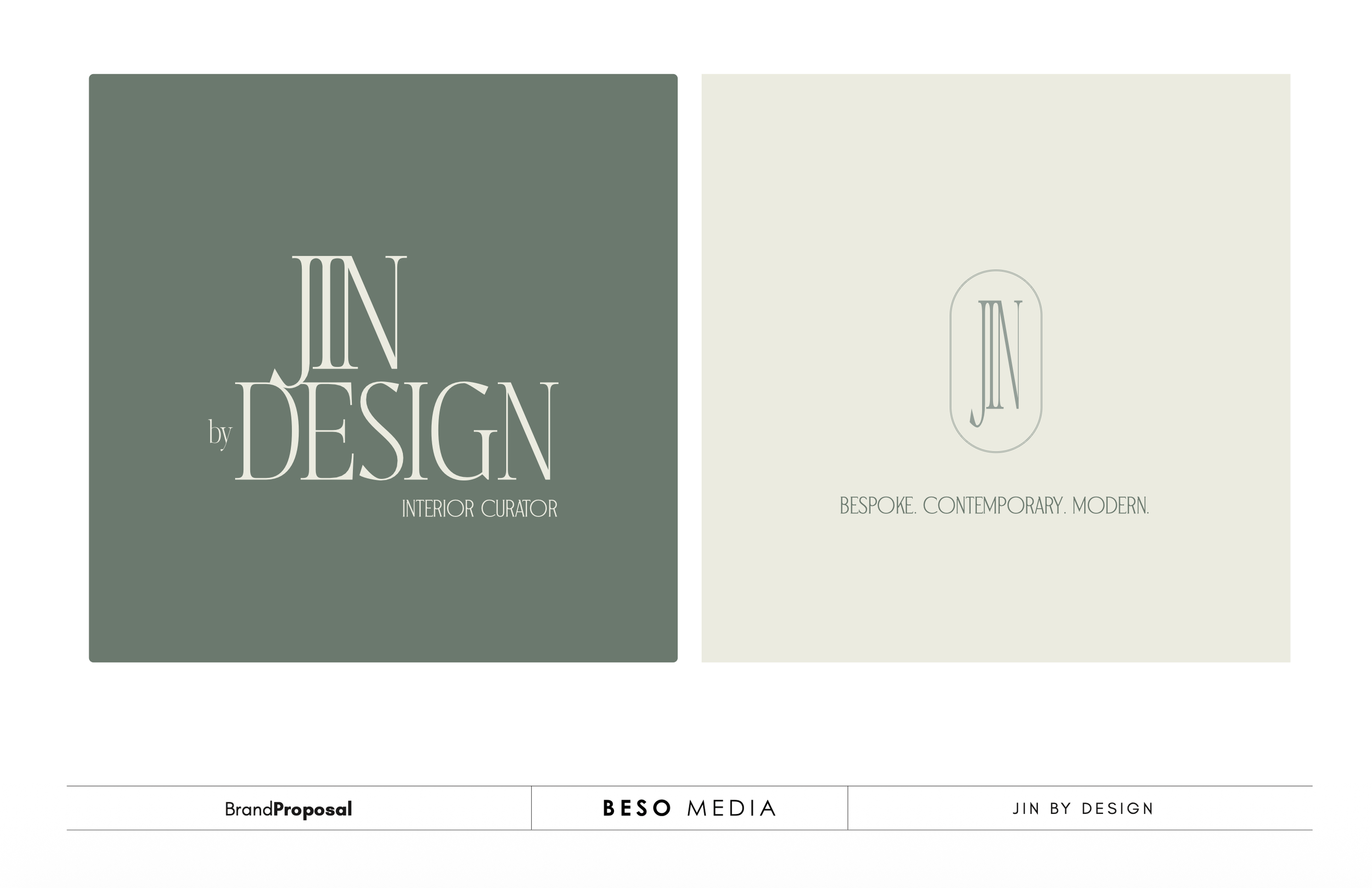
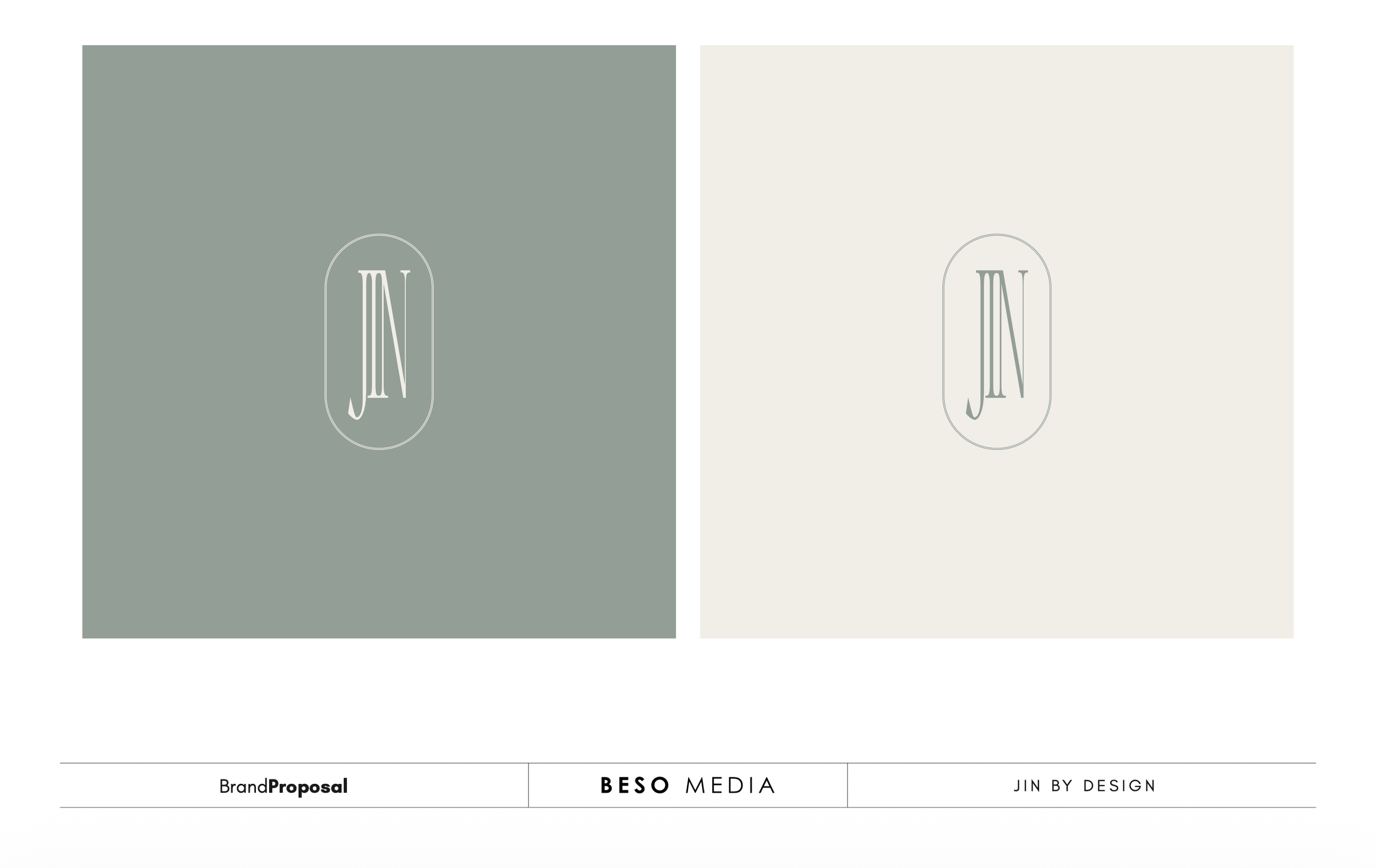
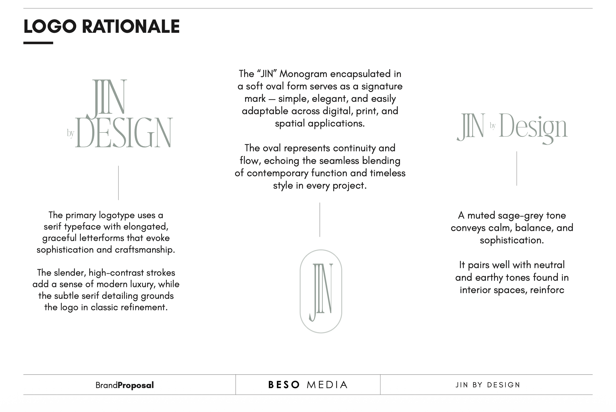
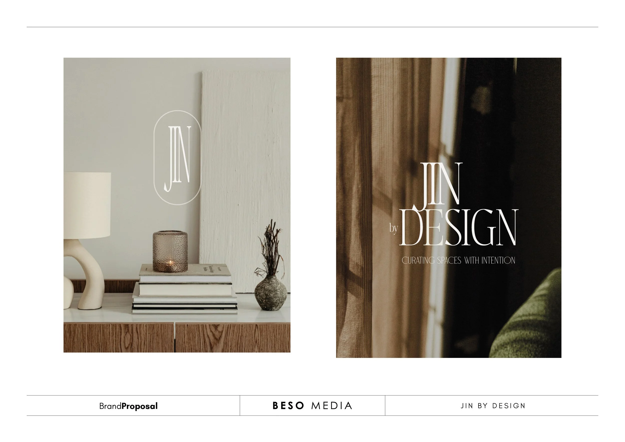
For the first concept, we stayed closely to Josephine’s initial direction: minimalist typography, sleek lines, and a refined visual language.
The idea was to explore a monogram built around JIN, paired with a simple geometric design element. The result was intended to feel clean and contemporary, with enough restraint to allow the identity to grow with the brand.
Concept 2
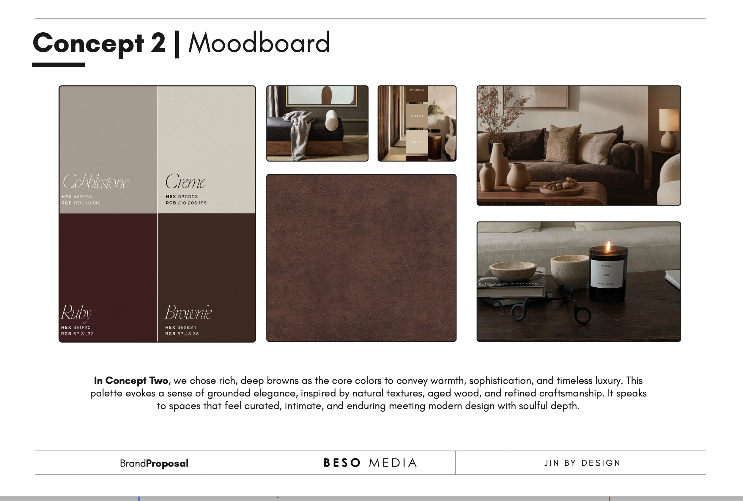
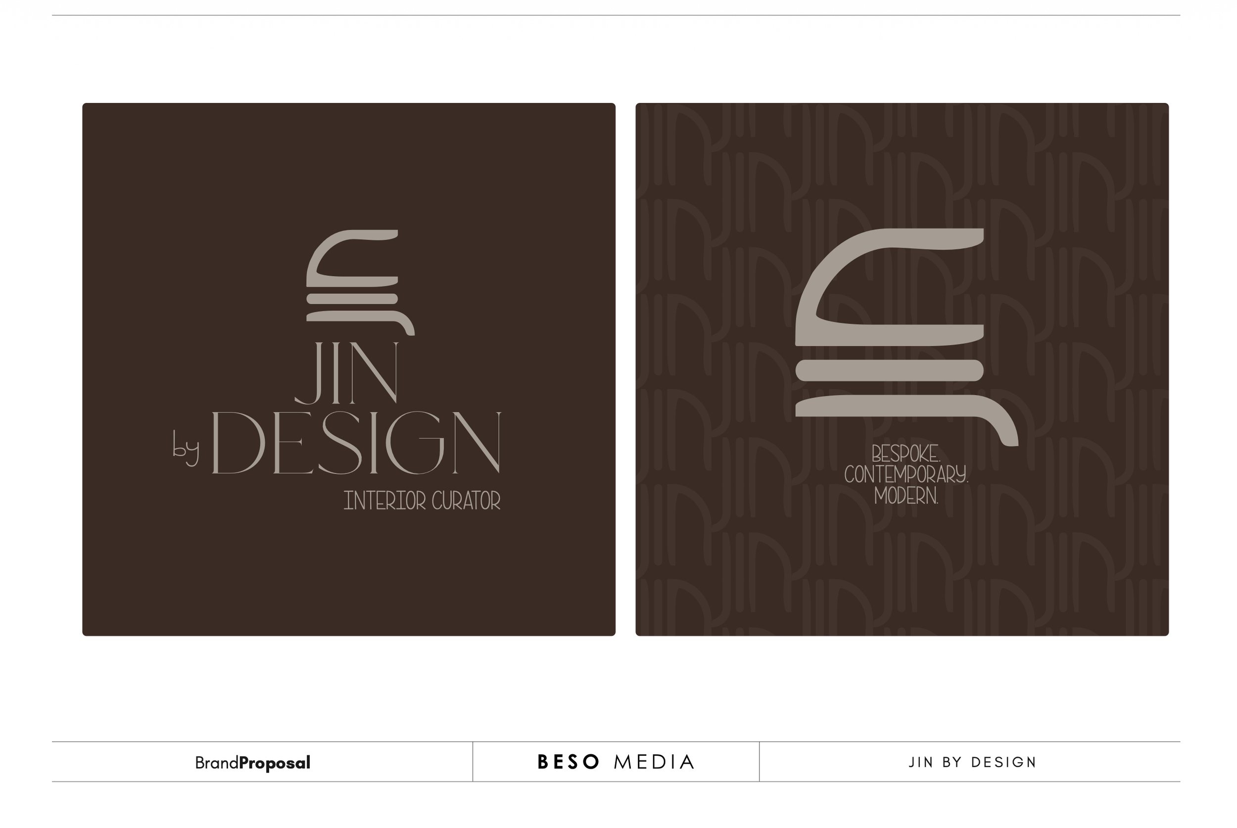
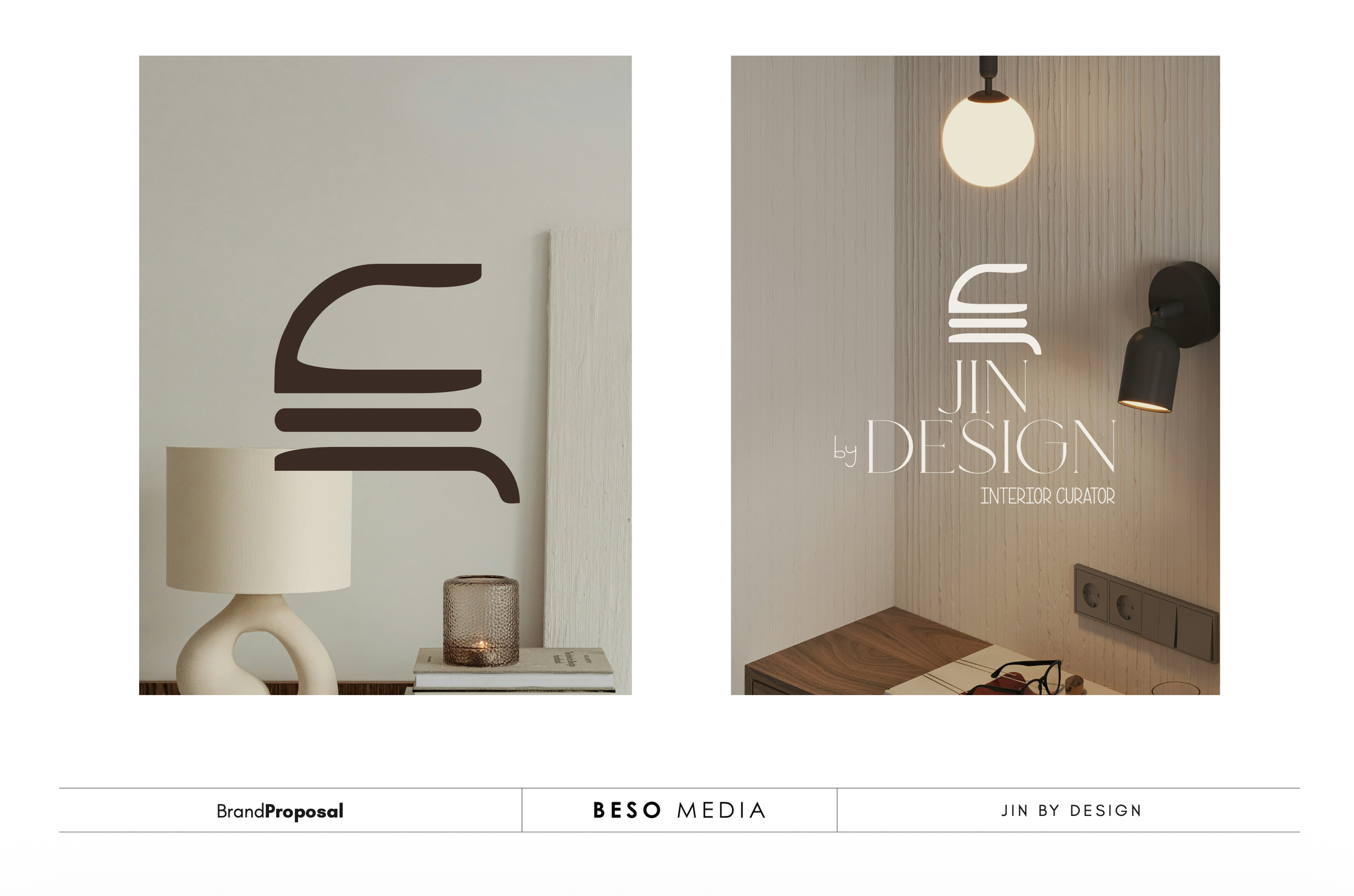
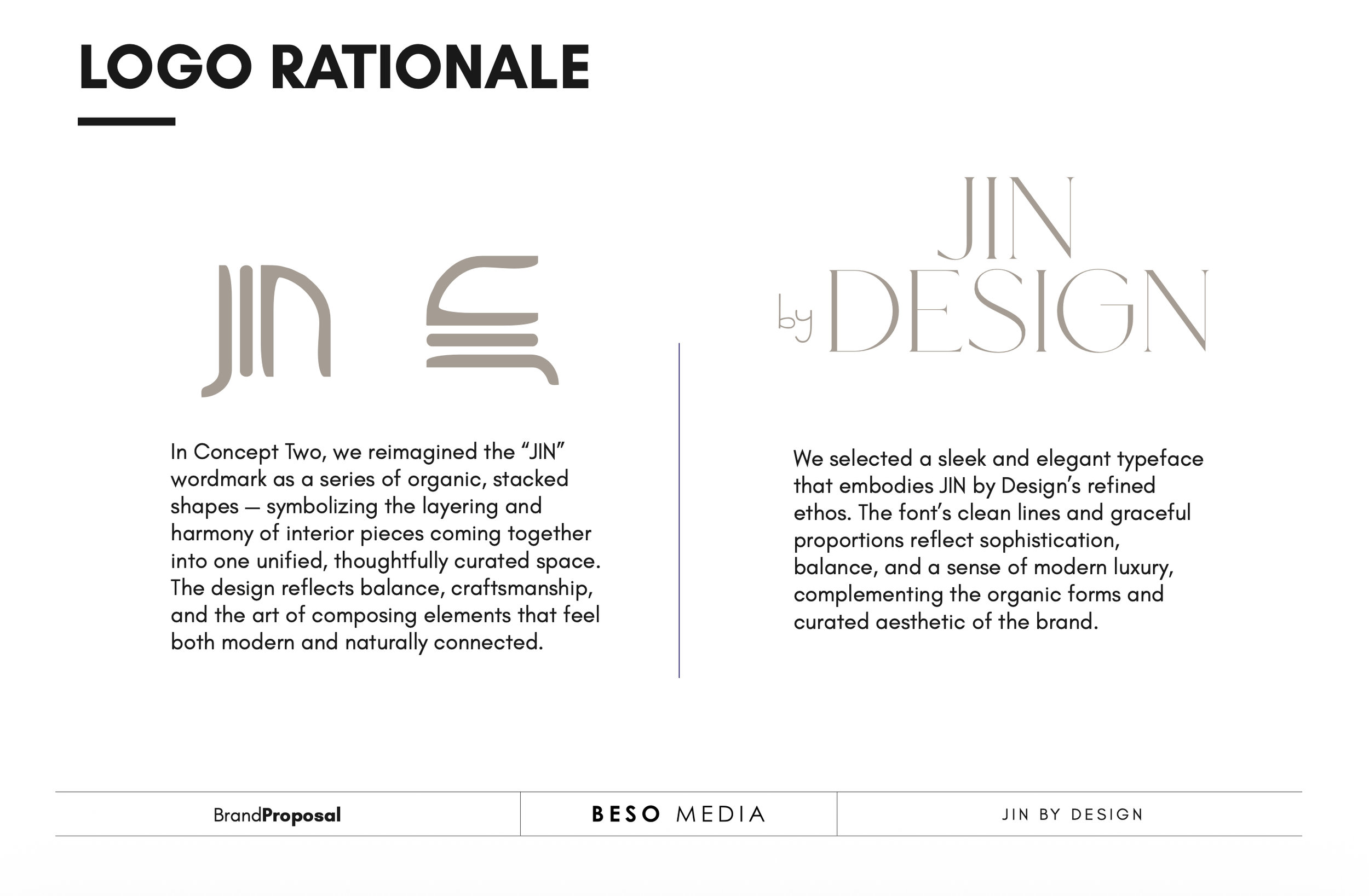
For the second concept, we wanted to push beyond the minimalism of the first direction and introduce more personality.
We were interested in creating something that felt distinctly rooted in an African context—not through the obvious or expected visual cues, but through shape, character, rhythm and a sense of place.
The result is a more expressive identity, while still maintaining the refinement and intentionality that drew us to the first concept. It feels deeper, more recognisable and, importantly, more connected to where the brand comes from.
Arriving at the Final Identity
As expected, Josephine took some time to sit with the proposal and the concepts. She came back with a few questions, so we booked a virtual meeting to walk through everything together, talk through the thinking behind each direction, and answer anything that needed more clarity.
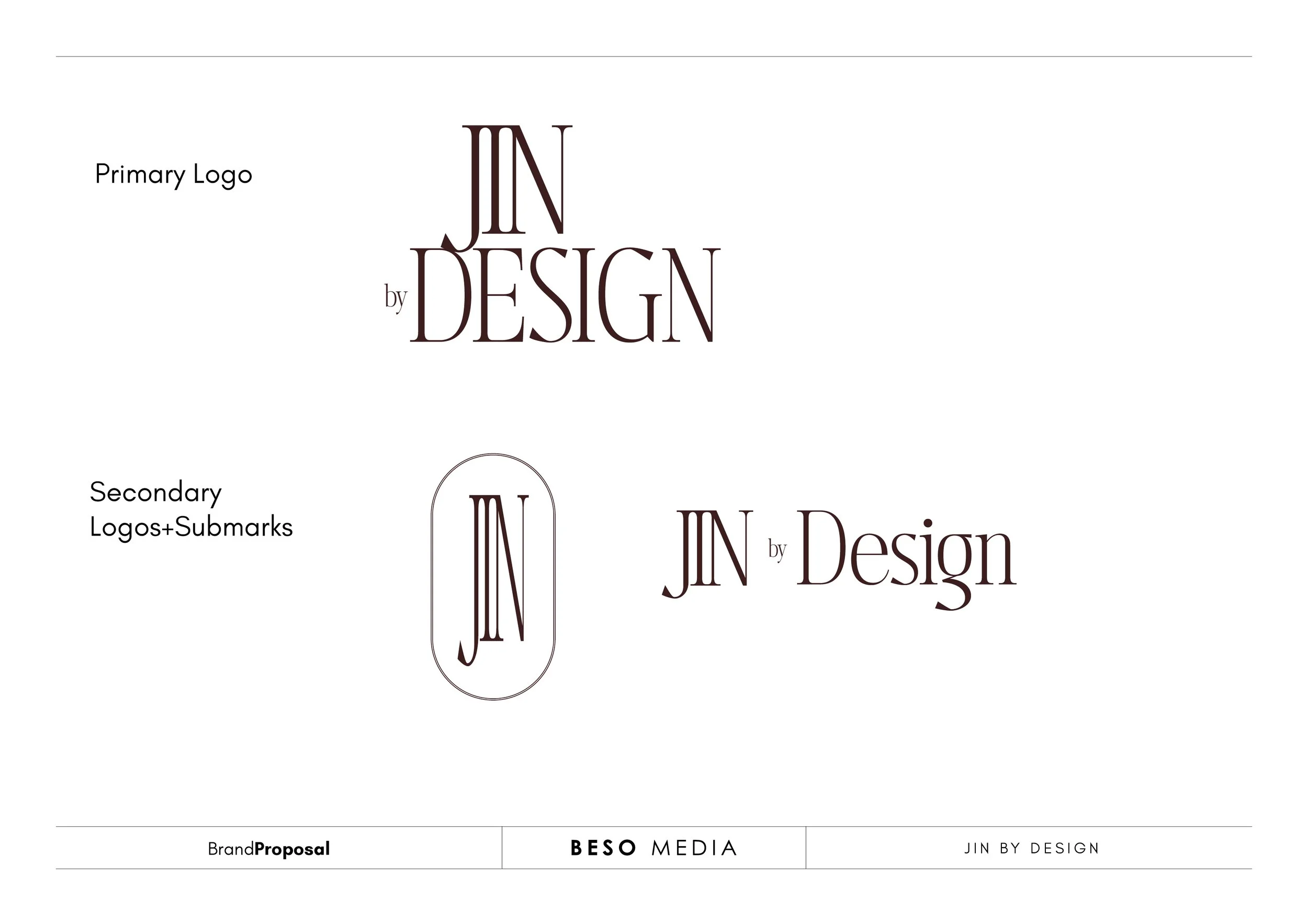
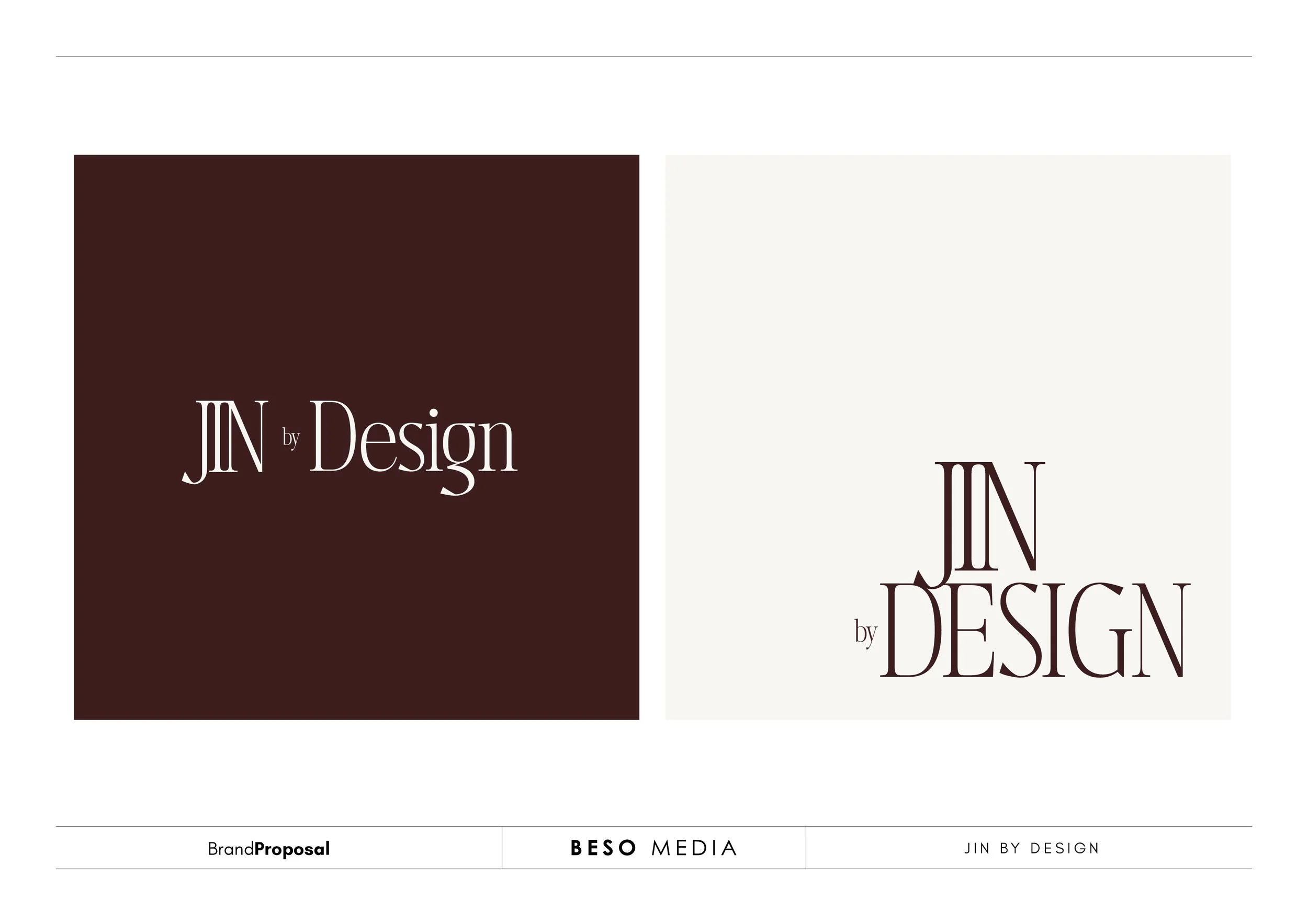
After some deliberation, she landed on an interesting combination: she wanted to explore the logo directions from Concept 1, but pair them with the colour palette we developed for Concept 2.
And that combination just worked.
It brought together the clean, considered structure of the first direction with the warmth, personality and African context of the second.
And that is how we arrived at the final identity for JIN By Design.
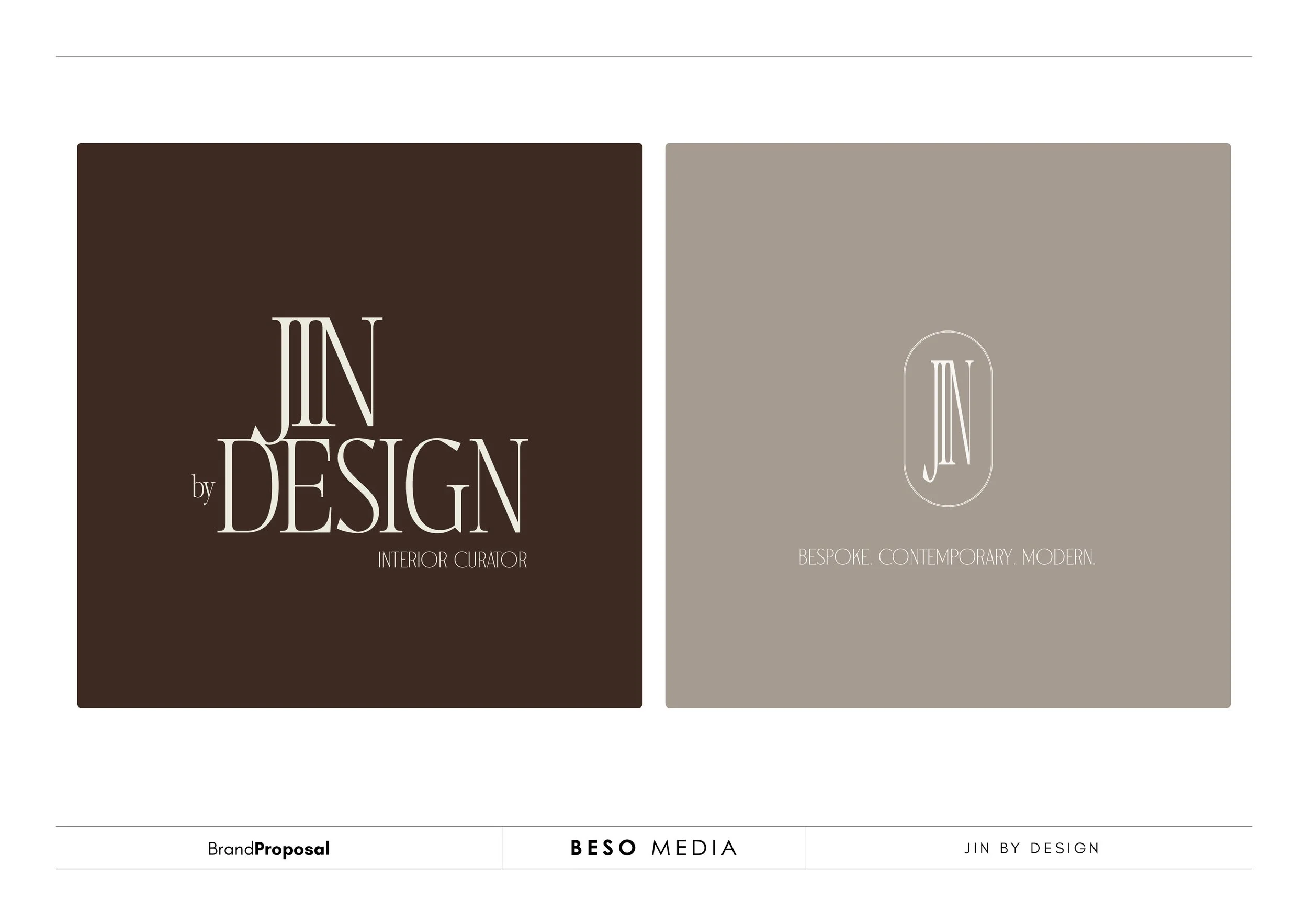
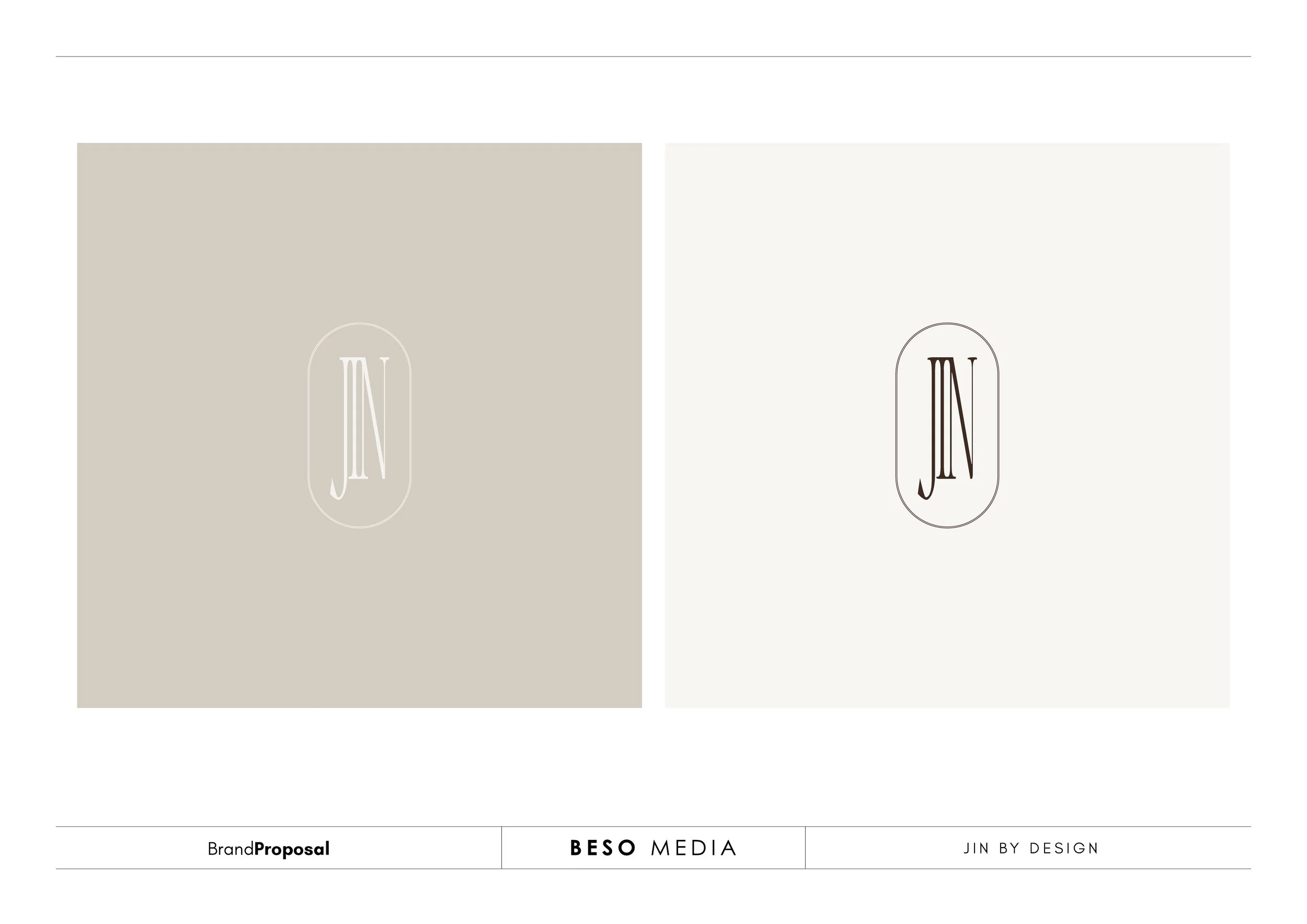
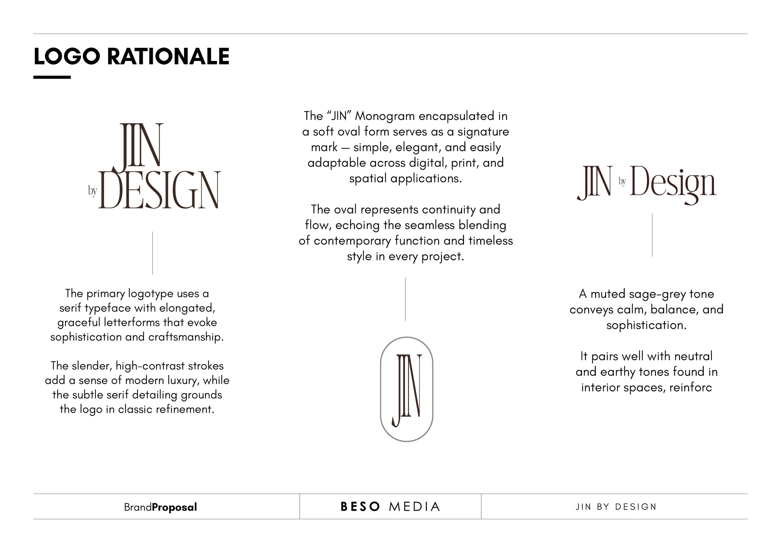
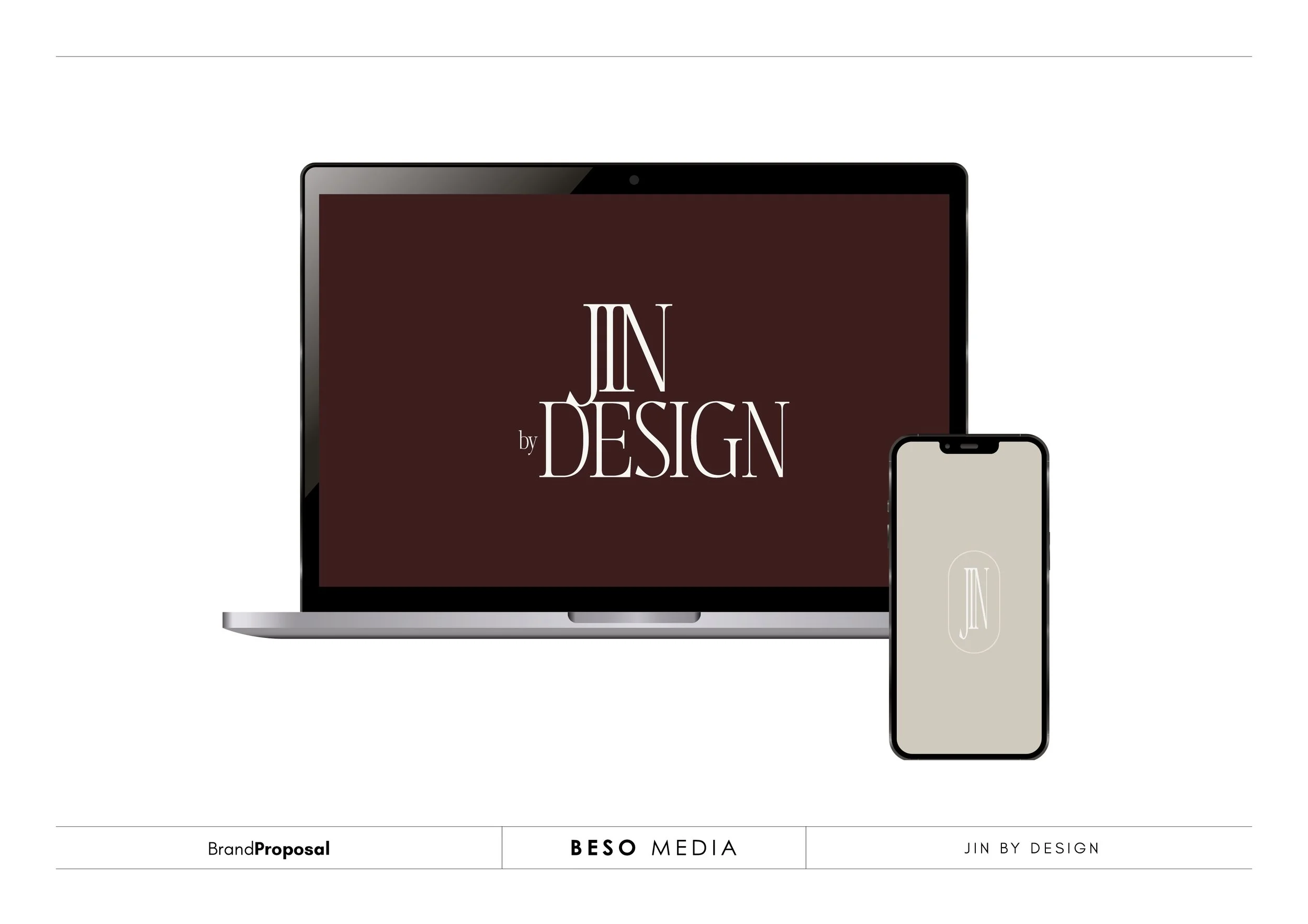
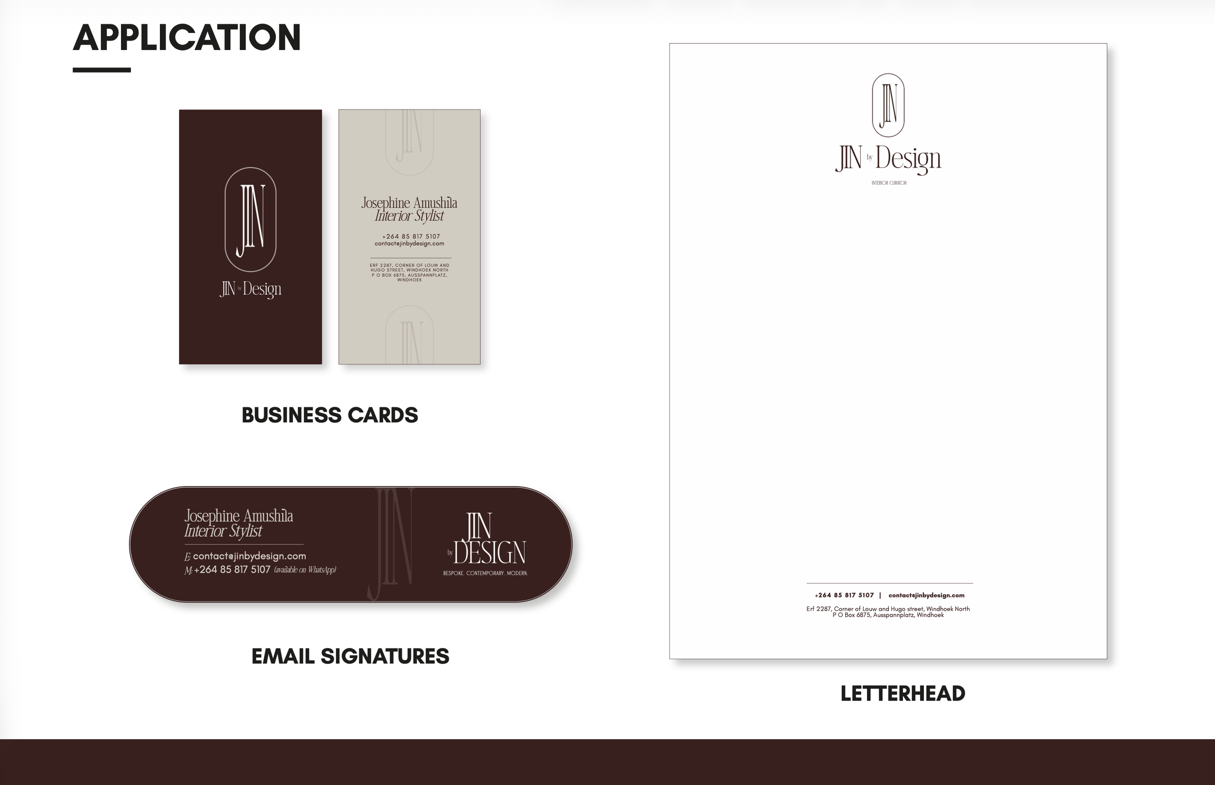
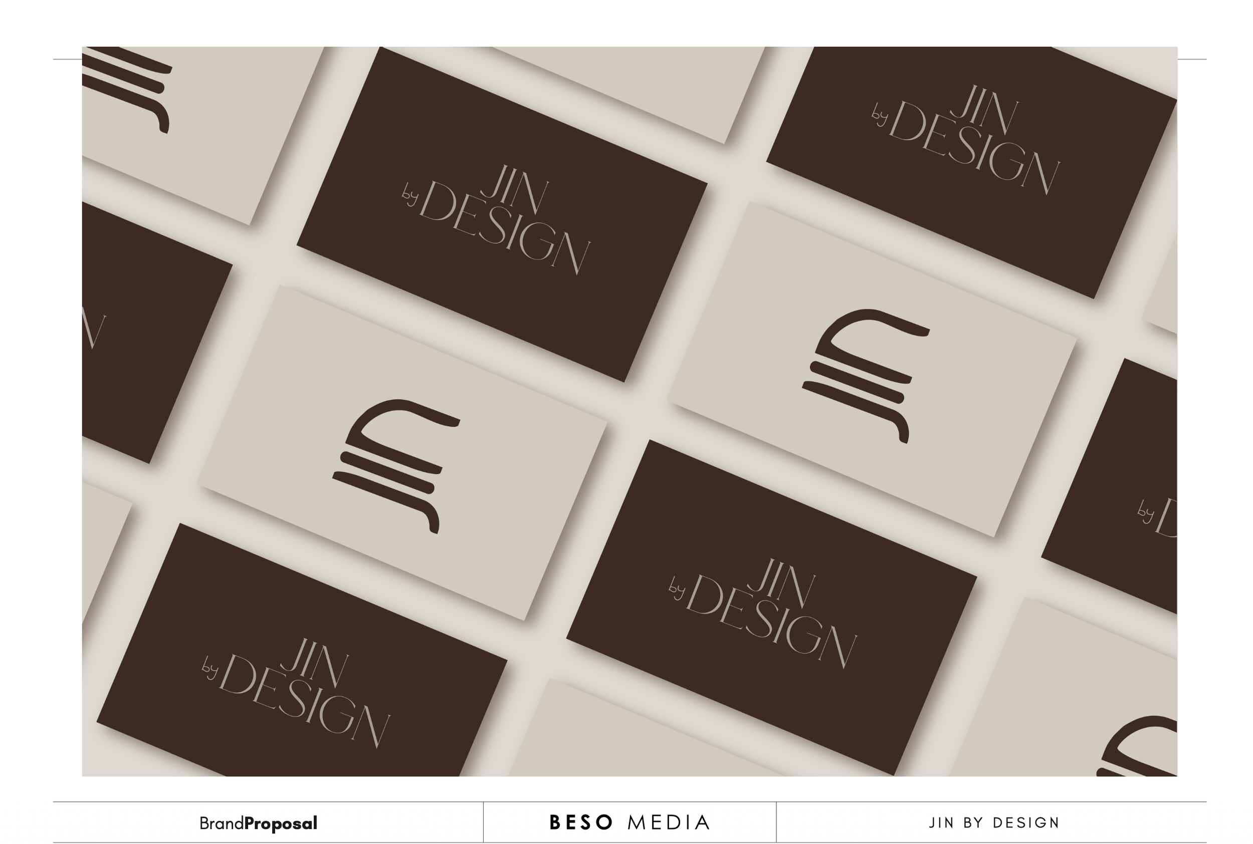
To close out the project, we packaged everything Josephine would need to confidently take the new identity into the world. Alongside the final files, we delivered a neatly organised folder containing all the brand assets, as well as a brand book to guide how the identity should be used.
The final deliverables included logo files, email signatures, a Word letterhead template, and print-ready business card files ready to send to the printers.
Another thoughtful identity added to our portfolio—and another reminder of how much better the work becomes when a client brings intention to the process from the very beginning.