
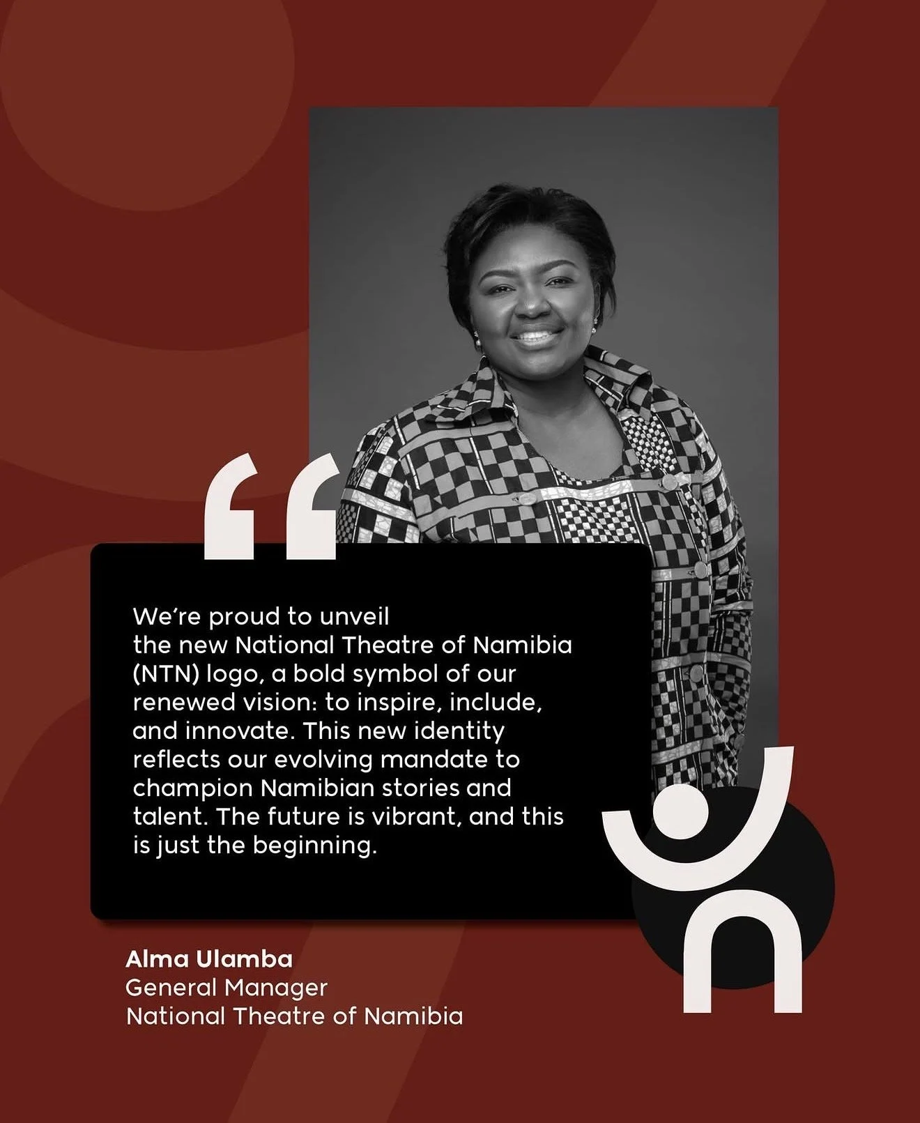
Rebranding the National Theatre of Namibia
It’s not every day we get the call to rebrand a national institution that’s been around for years.
But when you do get the call, you answer and put in the work to ensure you do a great job.
So we interviewed our Senior Designer, Avenida Katamila, who lead the rebranding of the NTN.

What was the core challenge or ambition outlined in the brief, and what was the National Theatre ultimately trying to achieve with this rebrand?
The brief focused on repositioning the National Theatre of Namibia with a more timeless, simplified identity while retaining strong brand recognition. Through our initial branding workshop, the key challenge emerged as distilling the existing logo, removing visual complexity without losing its cultural significance, so that the theatre could feel contemporary, enduring, and relevant across platforms and audiences.
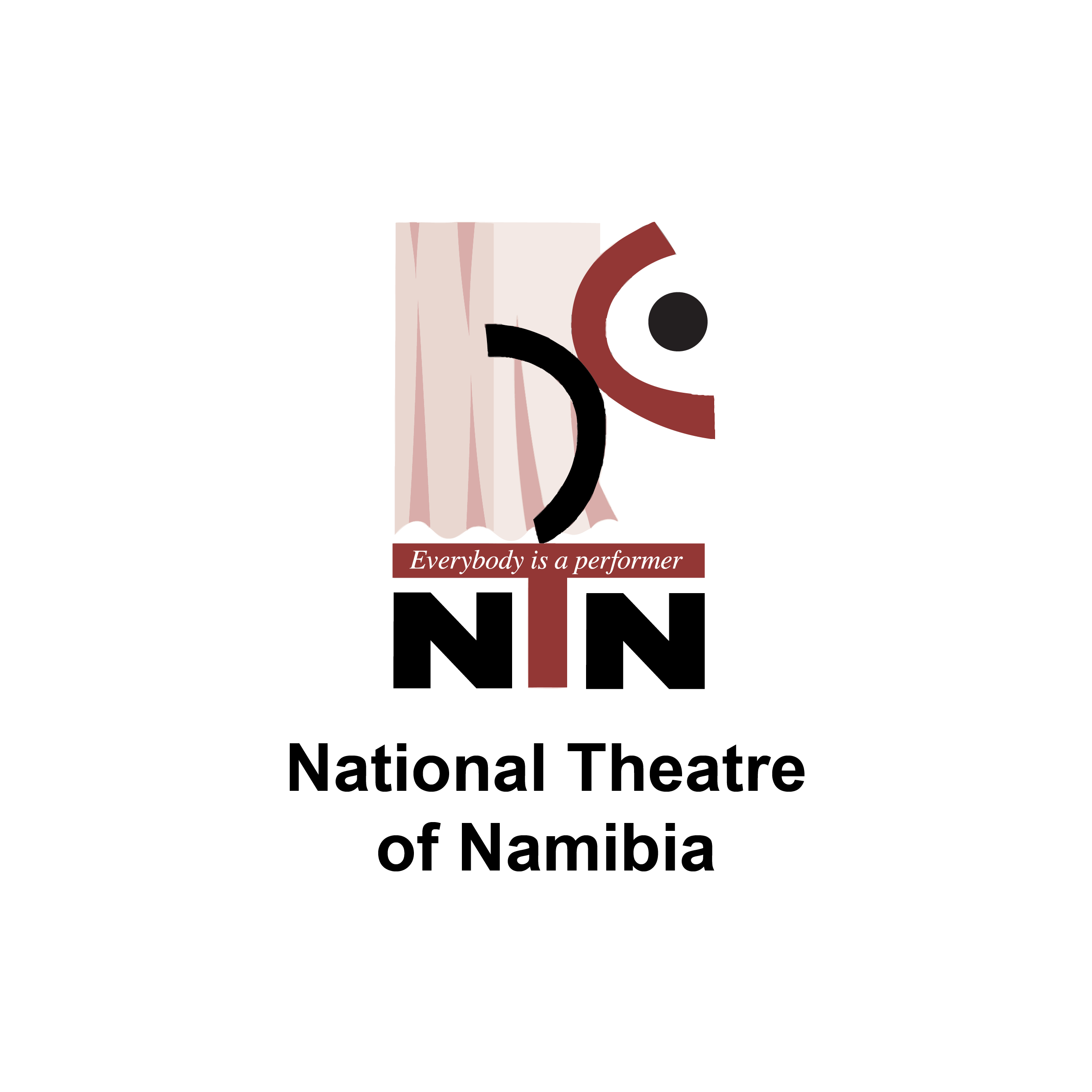
NTN’s Old Logo
How did you translate that brief into a clear design direction rather than a purely visual solution?
By focusing first on experience, not aesthetics, defining how the theatre should feel and behave rather than how it should look. That led to a system-led direction, where movement, tone, and adaptability guided the design, ensuring the identity functions as an immersive experience rather than a purely visual outcome.
Can you walk us through your creative process—from first insight to final identity and where the defining idea emerged?
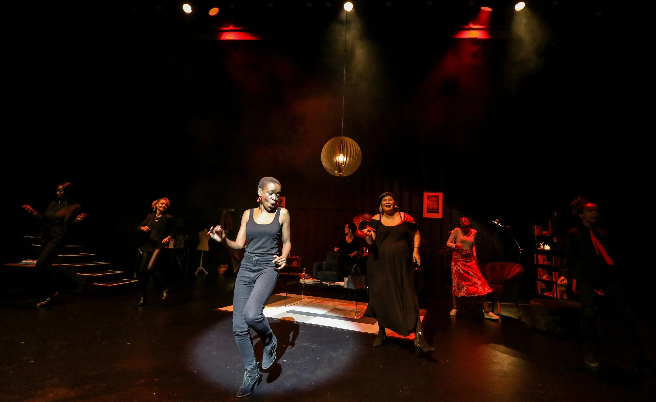
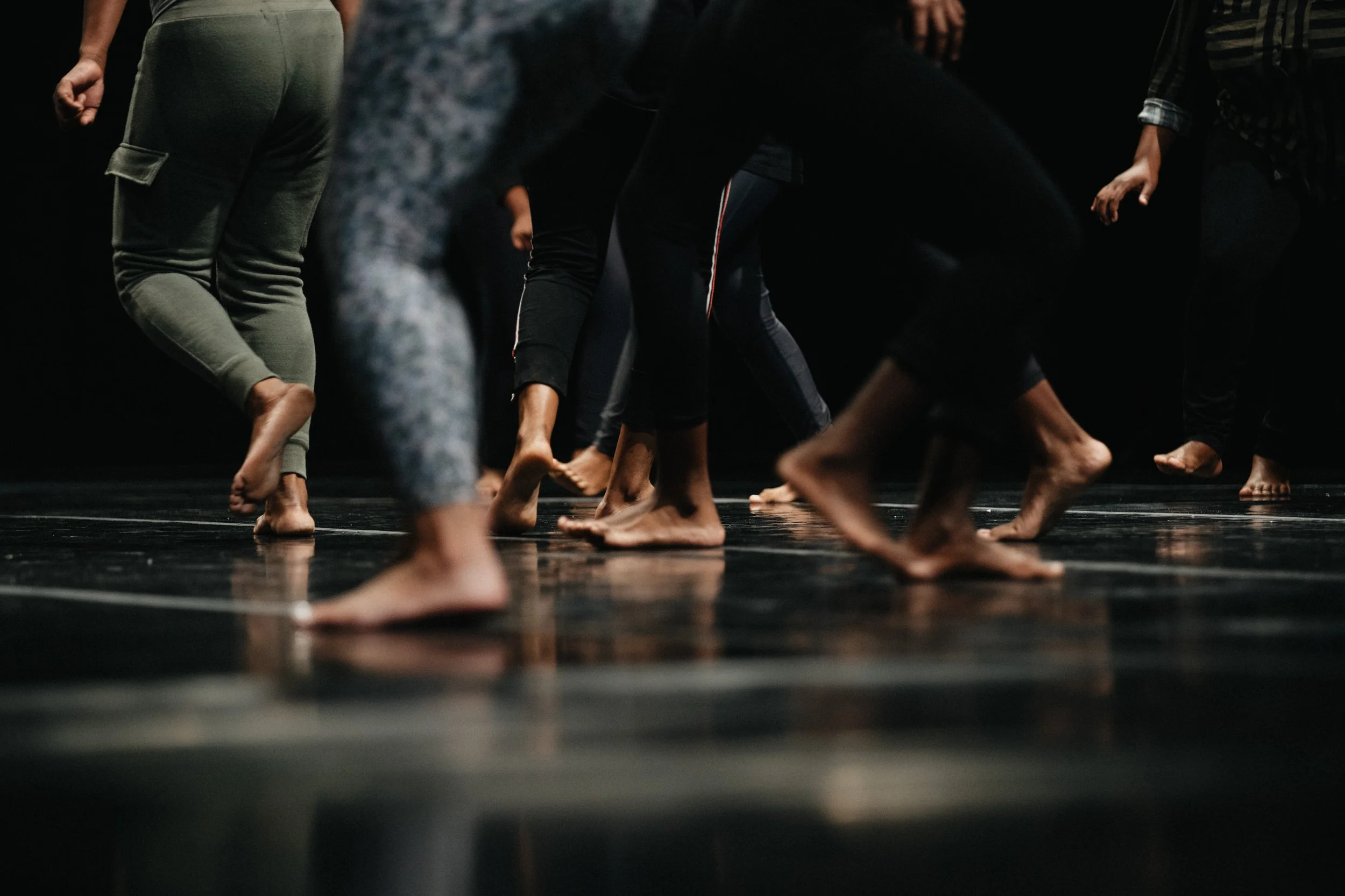
The process started with the insight that theatre is felt, not watched.
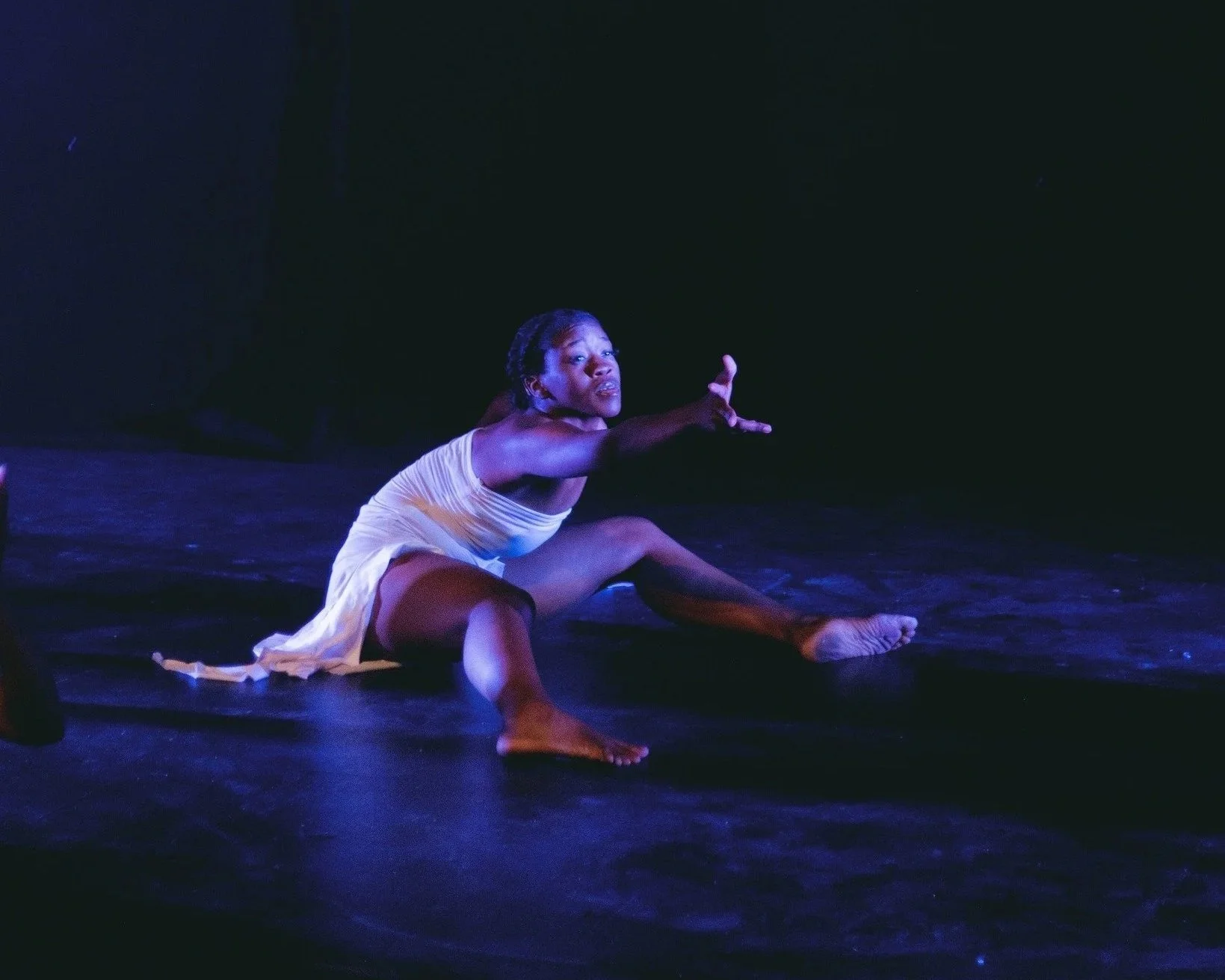
Moodboarding focused on atmosphere and emotion rather than visuals. That led to the defining idea early on: an identity that behaves like a performance. The final outcome is a flexible system that stays true to that idea from concept to execution.
How does this new identity reframe theatre as something immersive, lived, and emotionally felt rather than passive?
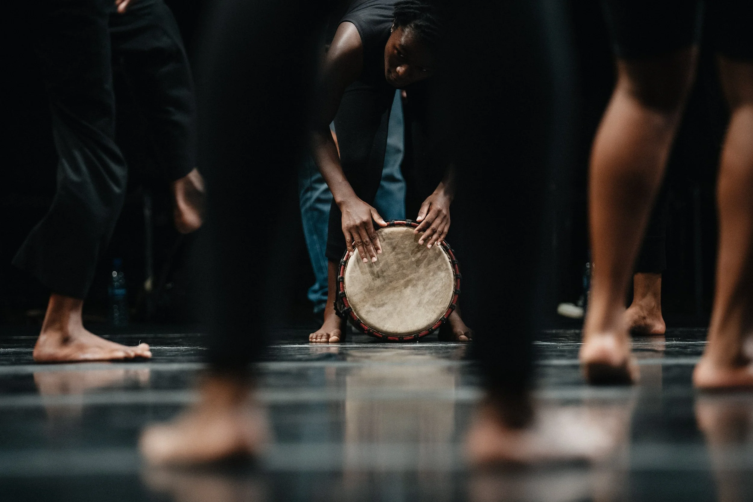
By designing the brand to behave like theatre itself, alive, human, sensory, and participatory, so audiences don’t just watch stories, they inhabit them.
Which single design decision carries the most strategic weight in this identity and why?
The sensory-led, moving figure was designed to evoke emotion, not serve as decoration.
While I did refine it, I was careful not to oversimplify, as it represents the NTN’s mandate: to develop, produce, and promote a vibrant and sustainable performing arts sector in Namibia.
Having worked with the NTN since 2018,
shaping their online presence, this rebrand was a necessary way to bring renewed clarity to how the story is told moving forward.
We’re now able to work more seamlessly,
guided by a visual system that holds the narrative together.
The previous identity served the institution well for all those years.
This one is designed to serve it now and into what comes next.
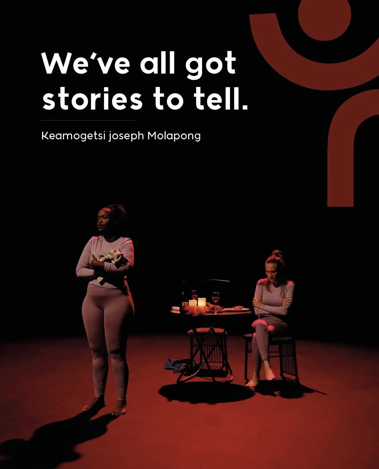
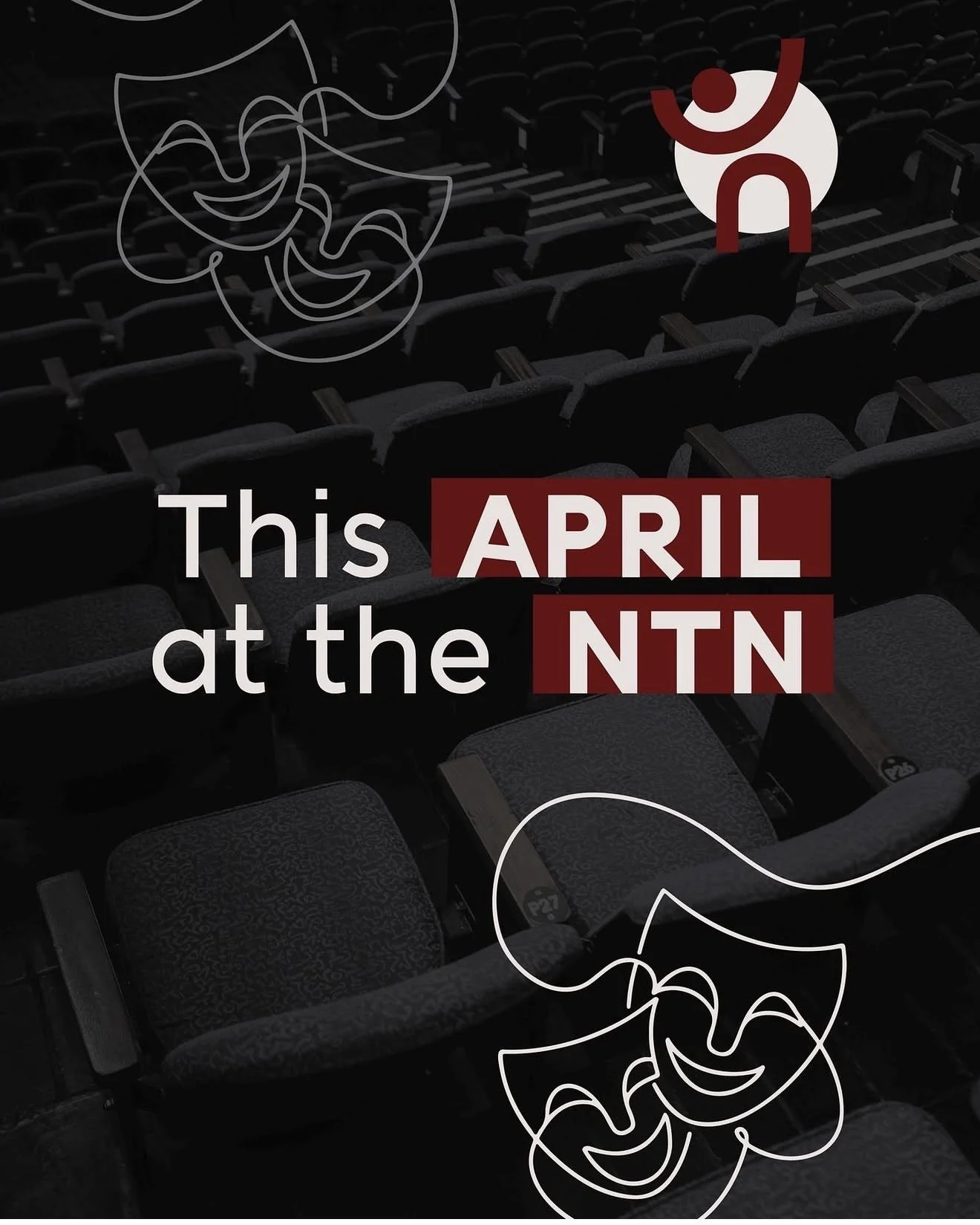
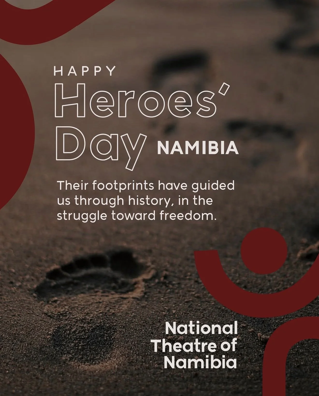
What followed was a focused rollout to ensure patrons, audiences, and the wider industry became familiar with the new identity.
From brochures to outdoor banners, from T-shirts to letterheads, we delivered a complete visual system — designed to carry the brand consistently across every touchpoint.