
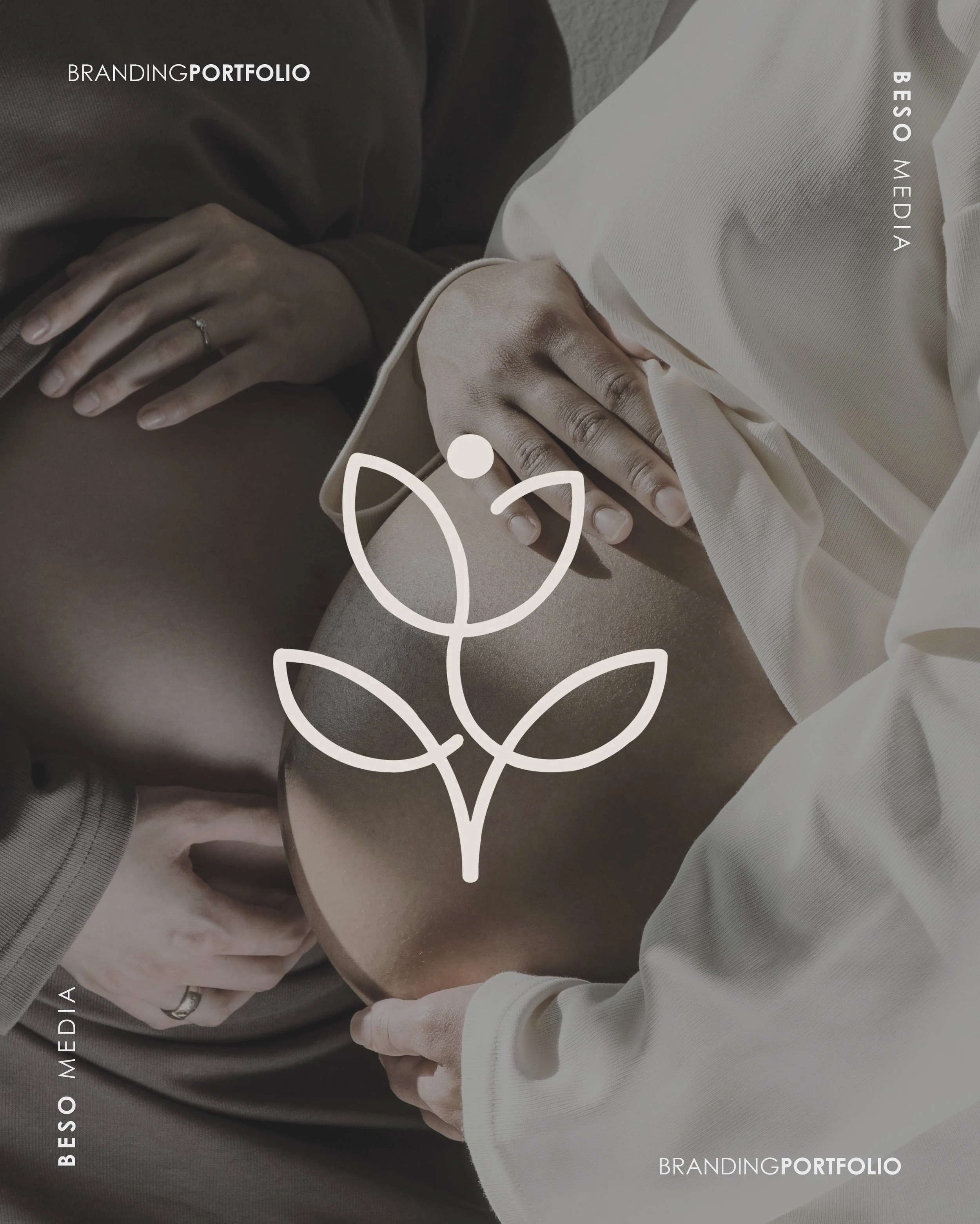
Branding Femme OBGYN
We start every year excited about the businesses we’ll have the honour of branding or rebranding. From small businesses to large corporations, retail to medical, the excitement is all the same.
As we update our 2025 portfolio, we are excited to share the branding projects we were honoured to work on.
Starting with Femme OBGYN.
Femme OBGYN is a Namibian trusted women’s health partner, providing compassionate and expert obstetric and gynecological care. Founded by a Namibian woman for Namibian women, the practice is dedicated to ensuring every patient feels heard, understood, and supported throughout their health journey. Specialising in pregnancy care, fertility support, preconception counseling, and gynecological concerns, Femme OBGYN offers a modern, patient-centered approach that prioritises comfort, accessibility, and professional excellence. With a deep understanding of women’s needs, the practice serves as a safe space where women receive the care, guidance, and empowerment they deserve.

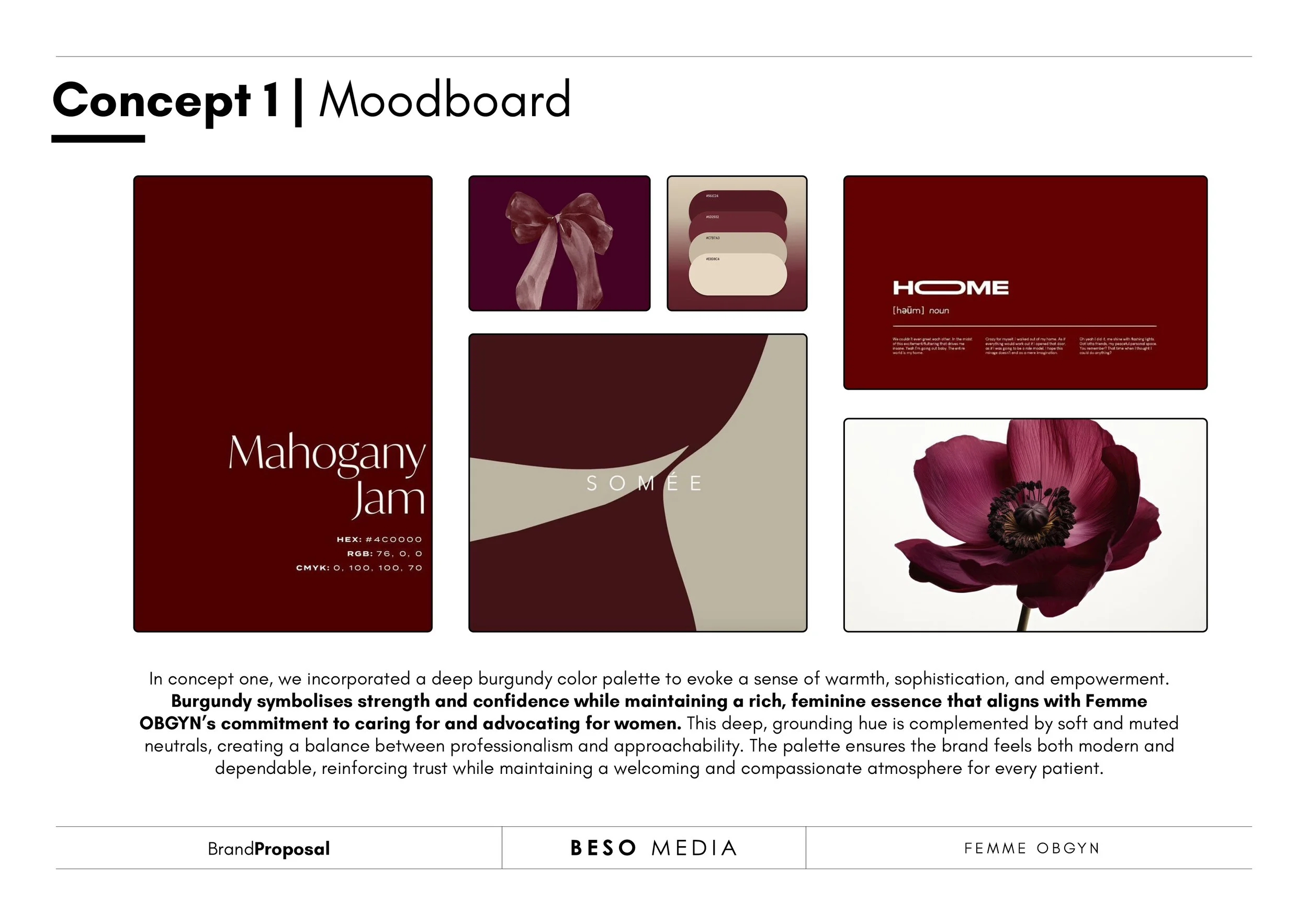
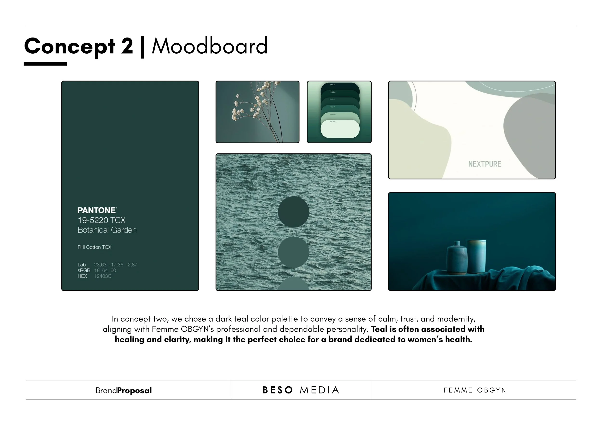
As always, we kicked off with a workshop, gathered everything we needed to know about Femme OBGYN and then went off to conceptualise and produce two lovely options.
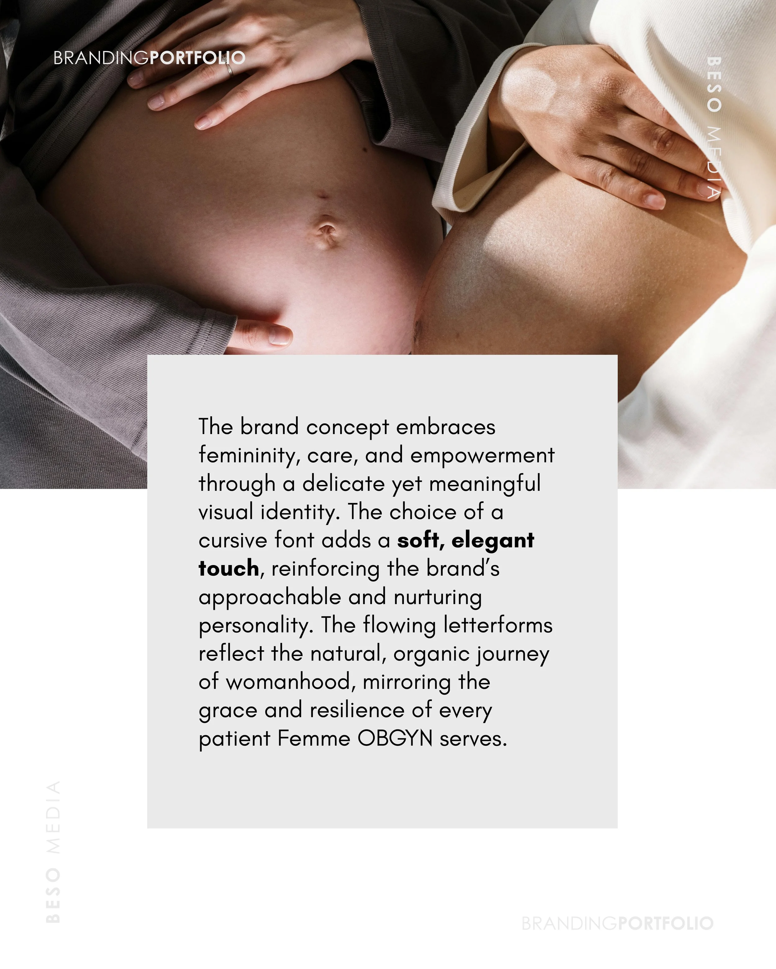
Our primary goal in developing the brand identity for Femme OBGYN was to create a visual and emotional presence that embodies care, trust, and empowerment—core elements of the practice’s mission to advocate for women’s health. The challenge was to strike a balance between medical expertise and the warmth of a supportive, approachable space where women feel heard and valued. The identity needed to reflect the professionalism of a well-trained specialist while maintaining a soft, feminine touch that reassures and comforts patients. By blending modernity with a nurturing, big-sister-like tone, the branding establishes Femme OBGYN as not just a healthcare provider, but a trusted partner in every woman’s reproductive journey.
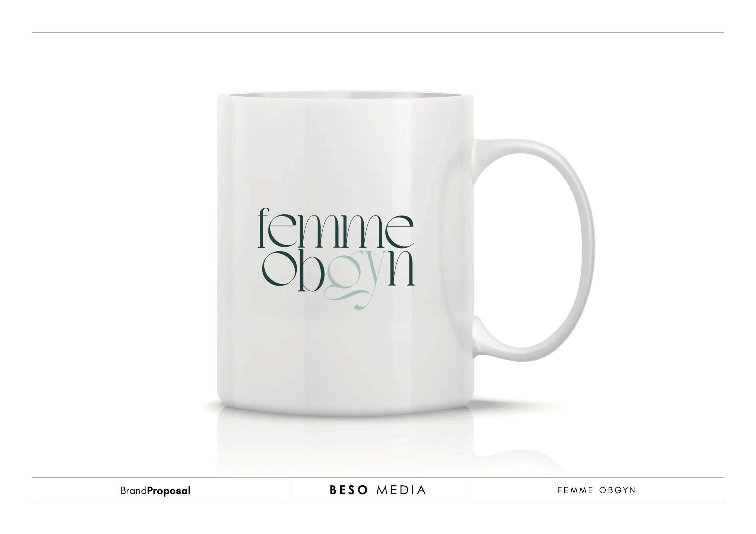
Along with the moodboards we illustrated our concepts’ possible visual identities. Showcasing what it would look like in real life.
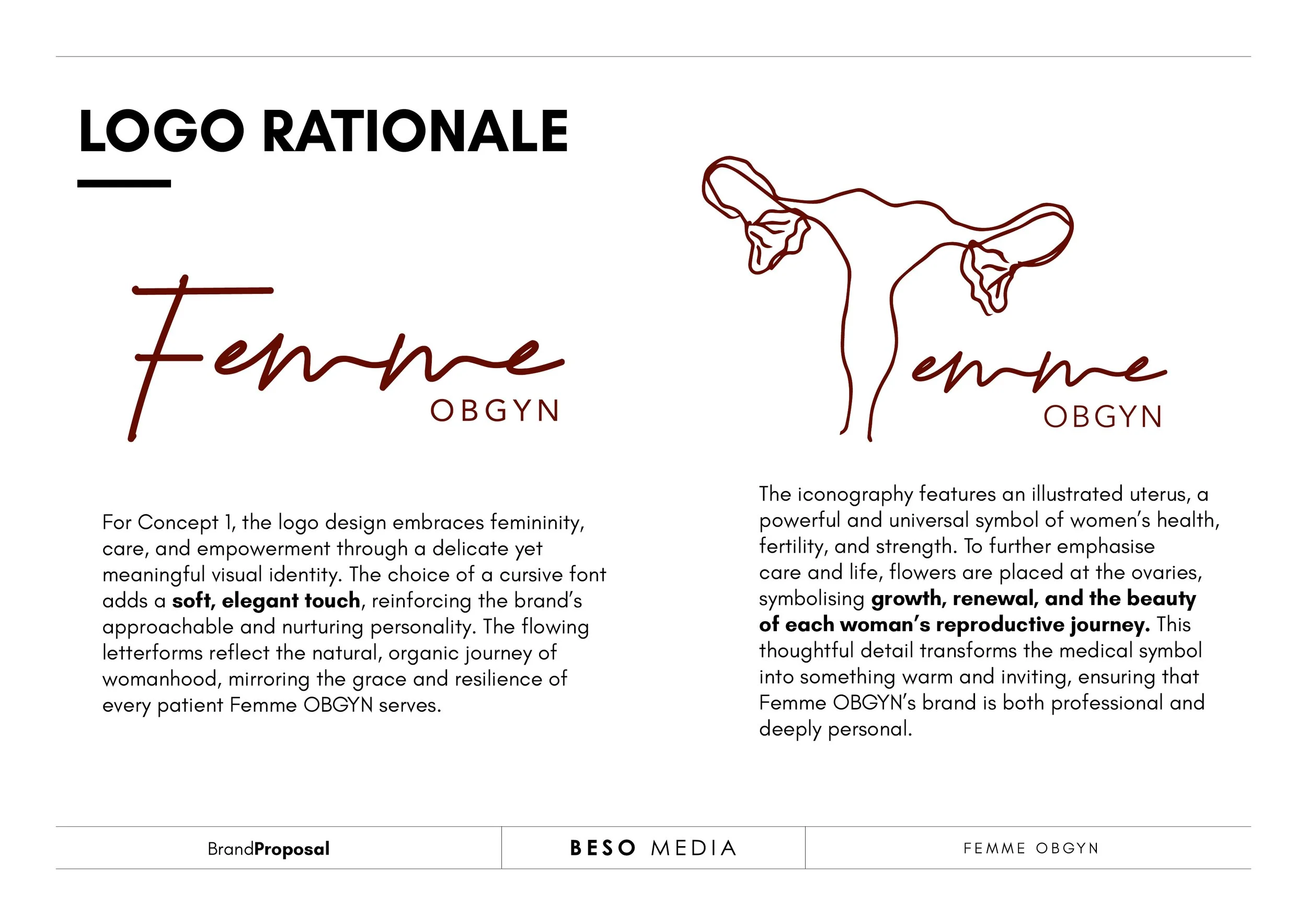
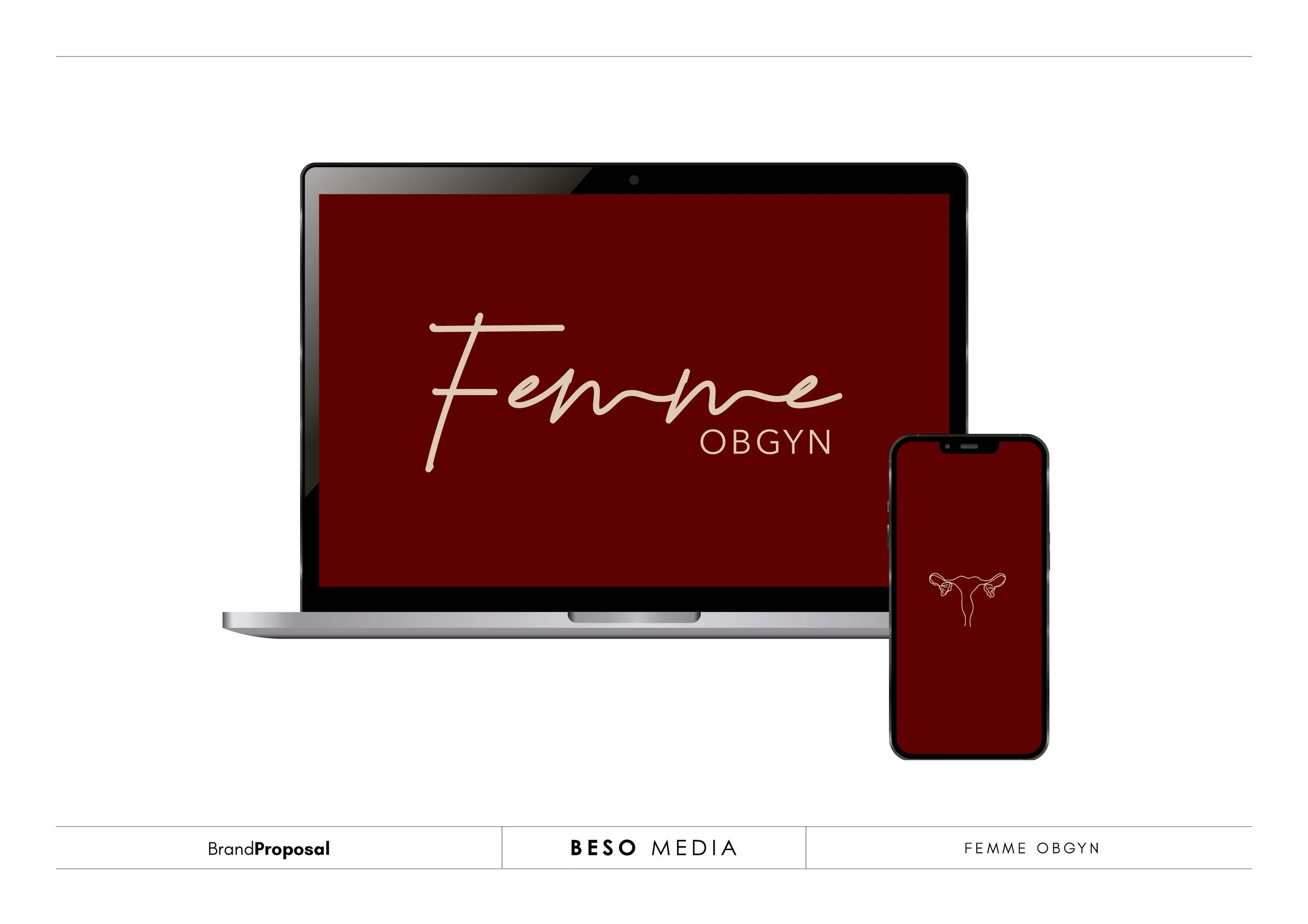
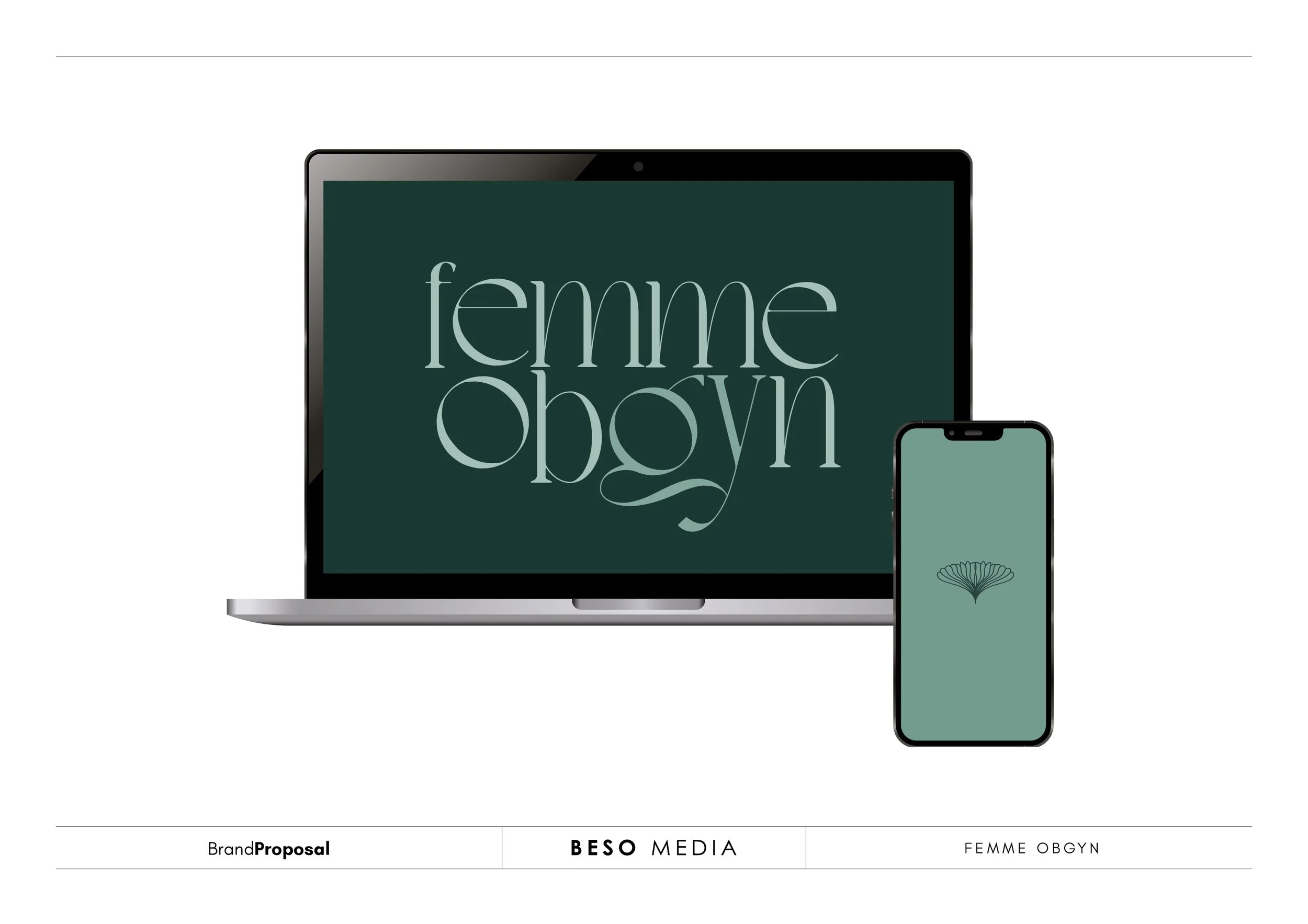
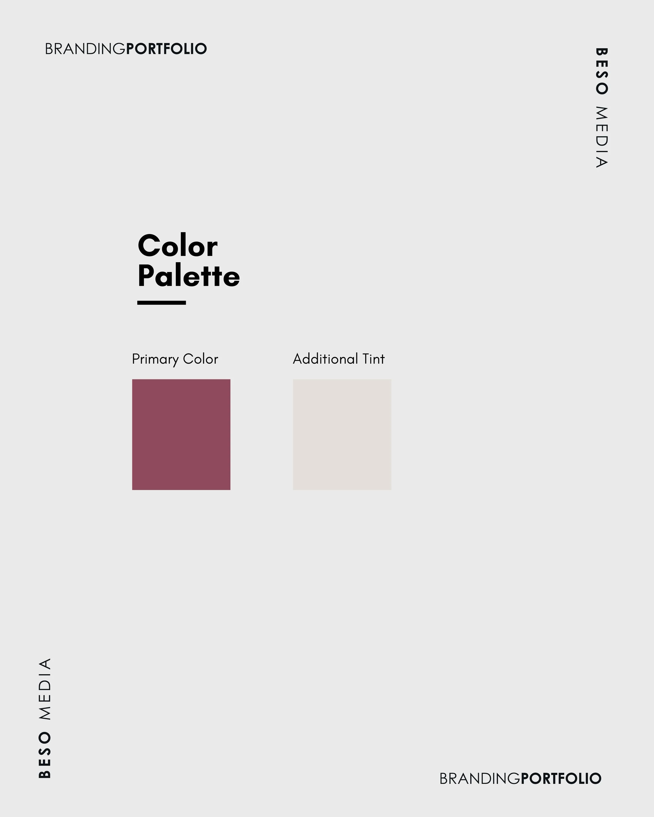
The client went with option 1 and suggested a different colour palette to the proposed options.
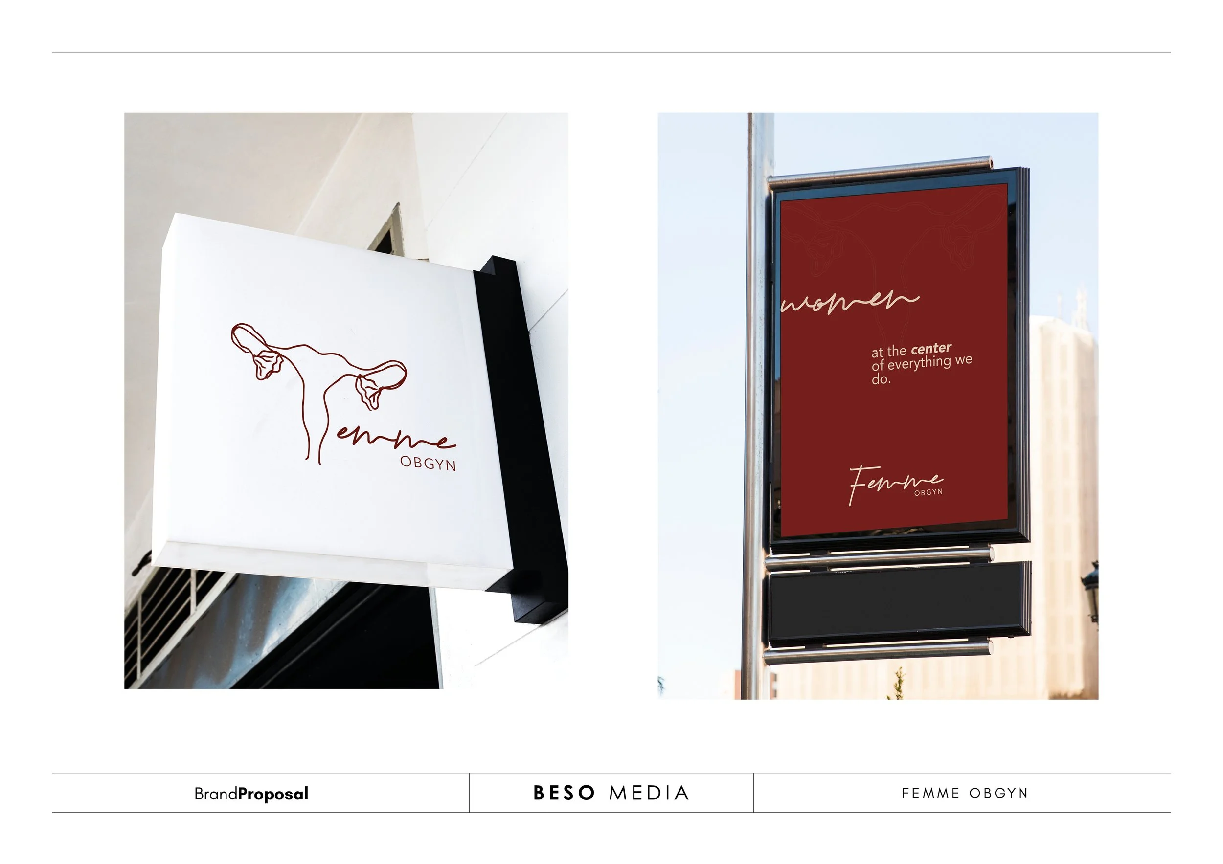
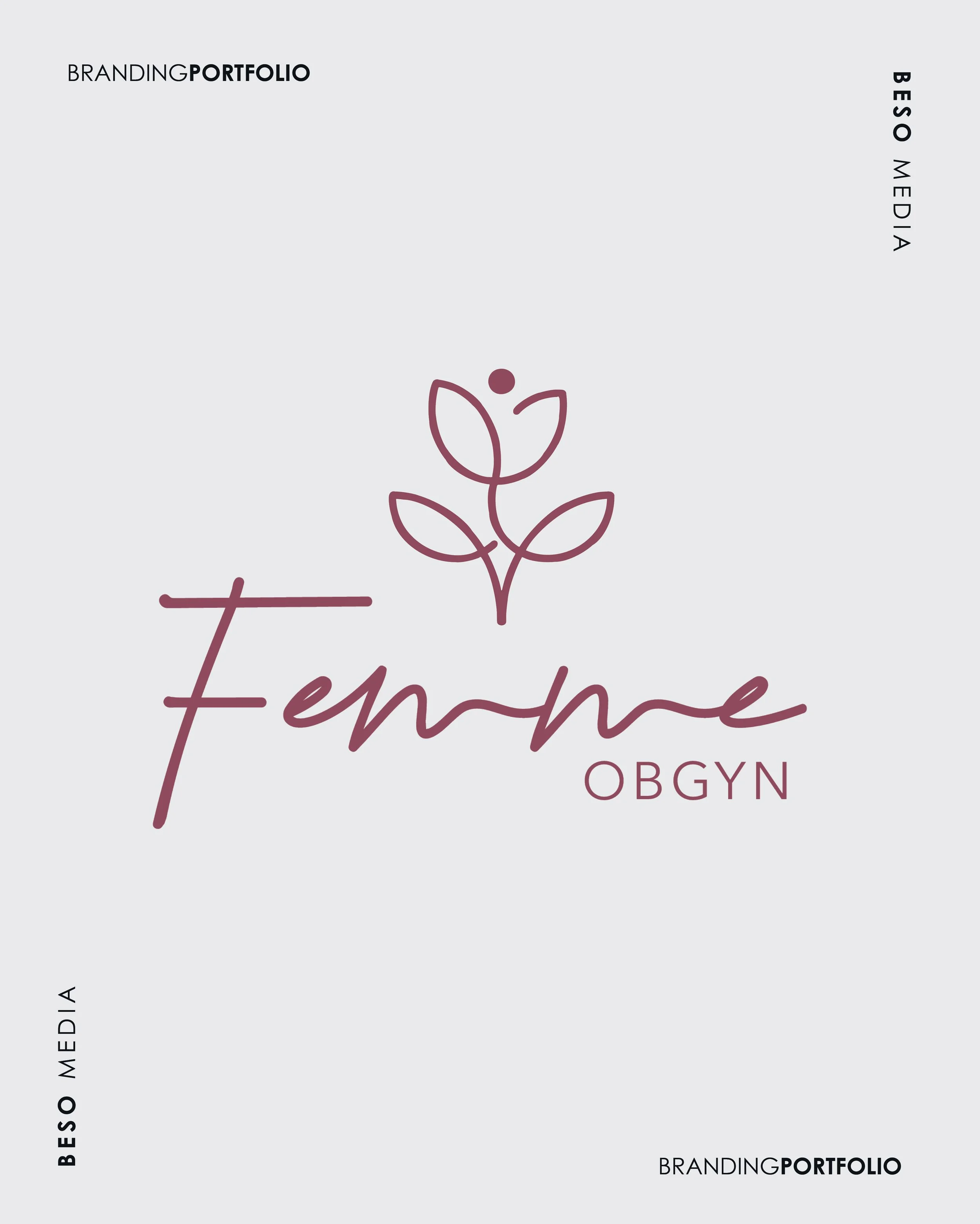
She also had a specific idea for the icon rather than the one presented so we took that feedback and went back to integrate it.
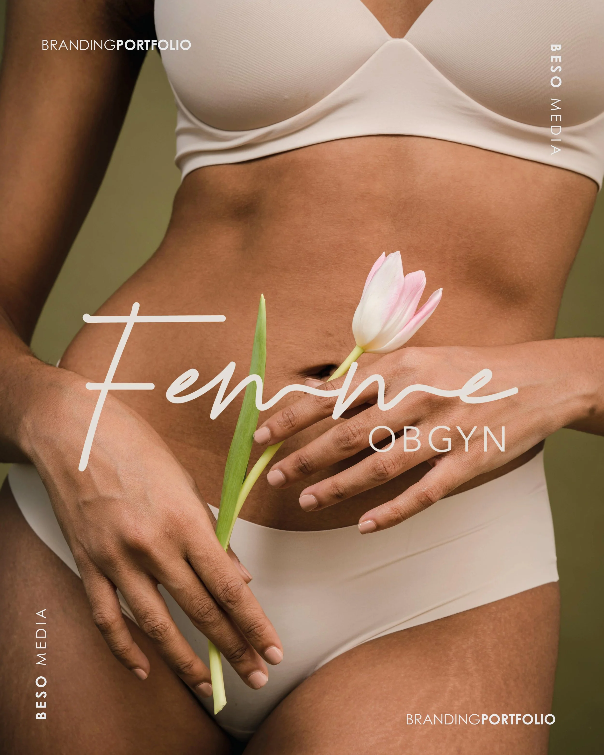
Here is the final visual identity for Femme OBGYN.


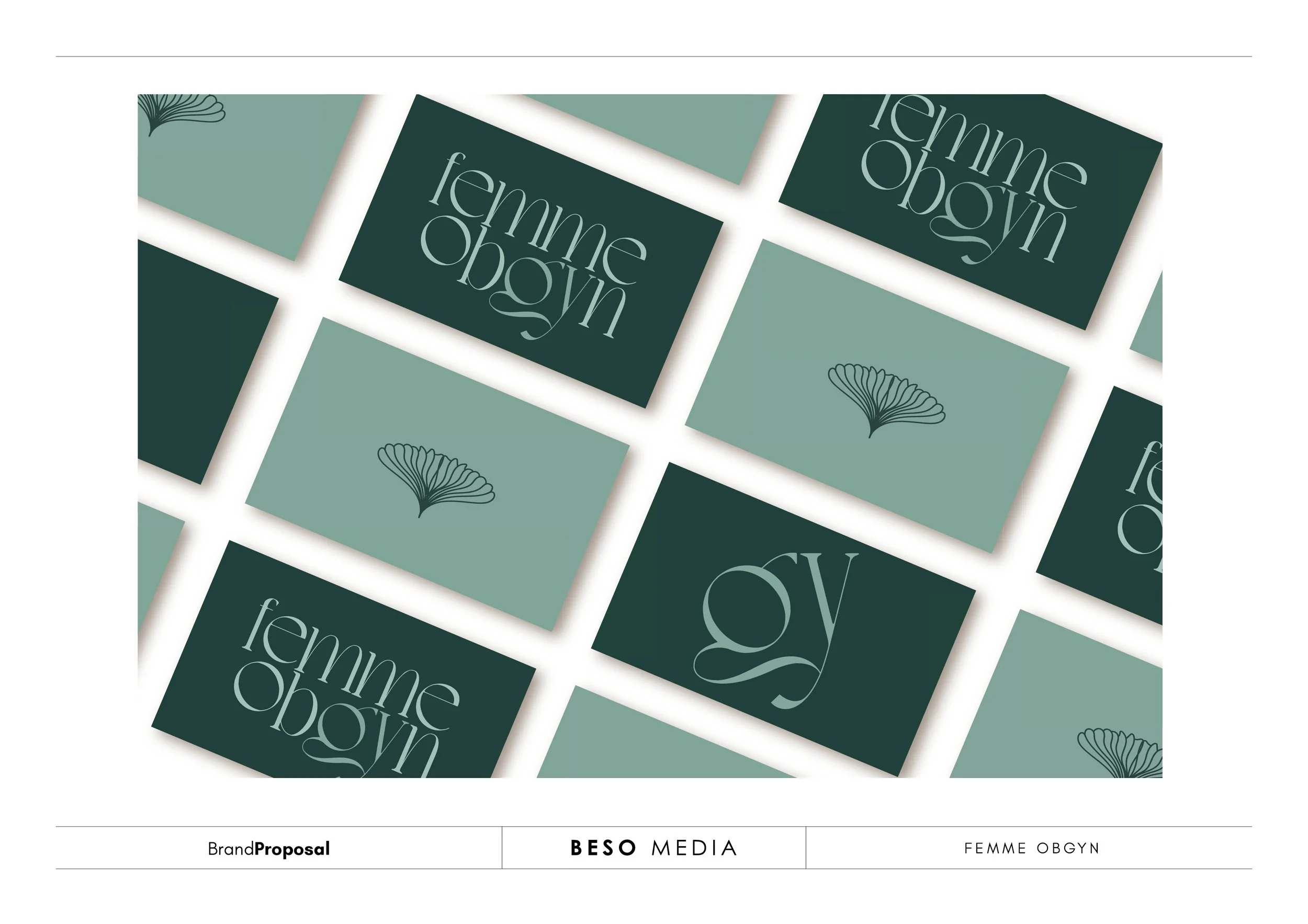
To finalise we prepared the collateral that included the business cards, email signature, letterhead and because it’s a medical practice we assisted in producing a template for their practice consent forms.
The project was a delight to work on. Let us know which concept you would have gone for. :-)